J B
Menu
← All work
/
Chapter I — Building products from ambiguity
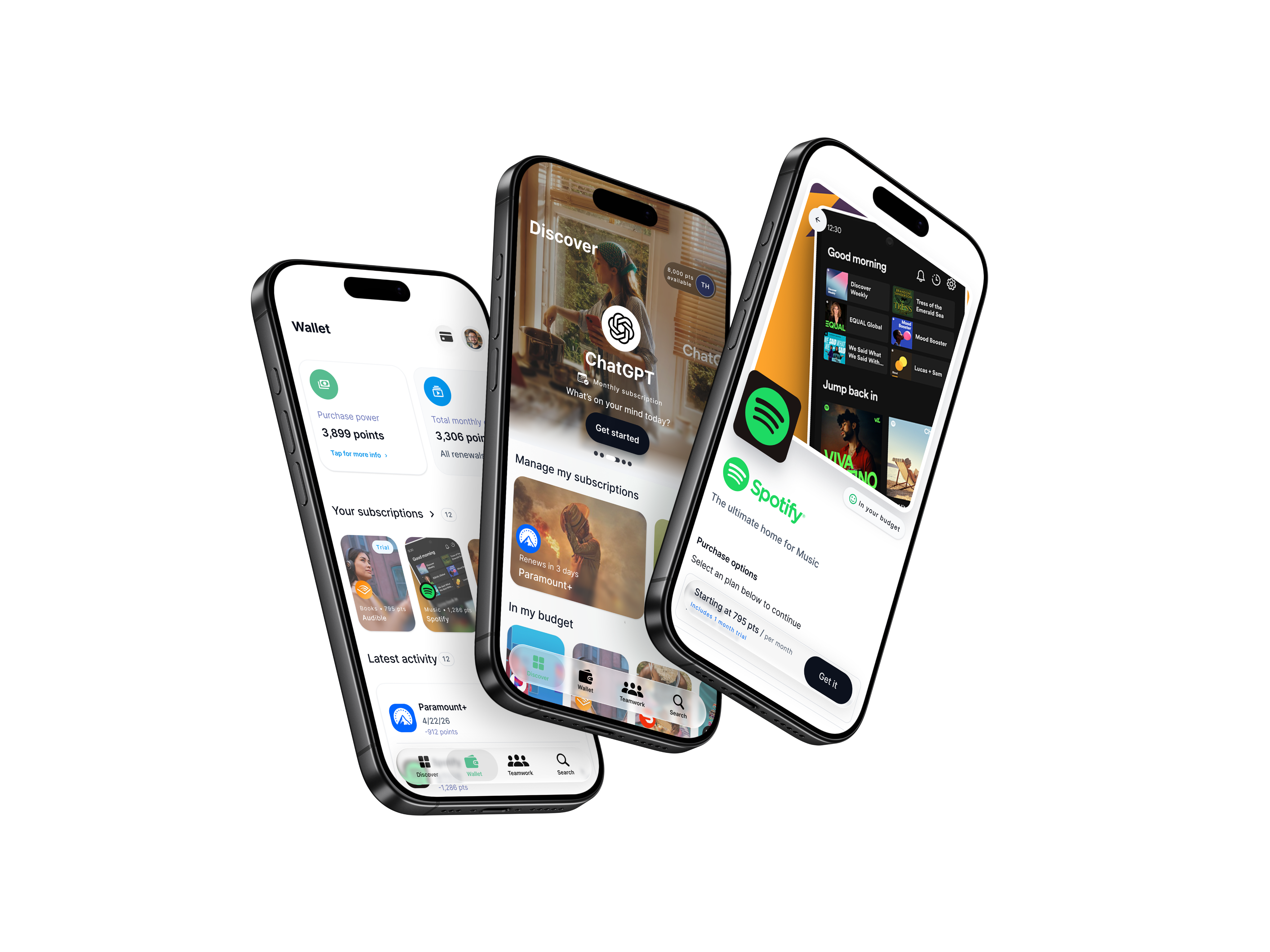
Marketplace: turning employer benefits into an app people open every day.
A concept with real ambition but no defined shape. I took it from an undefined idea to a mobile-first rewards ecosystem — the product strategy, the flows, and the system that holds it together.
Role
Director of Product Design
Company
Fufild
Platform
iOS • Android • Web
Scope
Strategy · UX · UI · Design system
The challenge
Employees received company benefits but rarely touched them after enrollment. Recognition programs were forgettable, fragmented, and delivered little long-term engagement.
The approach
Rather than add features, design a daily-use mobile experience where every interaction reduces friction, surfaces value quickly, and invites people back.
The outcome
45% of employees actively redeeming monthly points in the first deployment — 10 points above the industry benchmark.
01
Context
An idea with ambition, and nothing else yet.
The thesis was a daily-use app whose every interaction generates behavioral signal that powers an ecosystem around it — rewards, recognition, and the tools people need on shift.
Background
Employers were already paying for benefits and recognition, but the value never reached everyday life. Enrollment happened once, then the benefits disappeared into a portal nobody opened.
There was no system, no flows, and no visual language to build on — every decision was still open. My job was to give the idea a shape: decide what the product is, who it serves first, and the foundation it would grow on.
Who it’s for
Hourly & shift employees
On their feet, phone in pocket, minutes between tasks.
Managers
Need to recognize and inform their team without another tool.
Employers & HR
Fund rewards and need proof they’re landing.
Business goal
Turn employer benefit spend into measurable, everyday engagement — and give employers a signal they can act on.
02
The problem
Employees had benefits. They had no reason to come back to them.
Three problems shaped the product — two in how employees experienced benefits, one in what there was to build on.
01
Invisible after enrollment
Benefits were chosen once and forgotten. Their value never surfaced in the moments people could actually use it.
02
Recognition that didn’t land
Programs were fragmented across tools and generic. Shift teams had no Slack or Teams, so recognition simply got lost.
03
No shape to build on
No system, no flows, no visual language. Without a foundation, every new feature would have been designed from scratch.
03
Process
How the work actually happened.
Business goals → user needs → strategy → system → experience → engineering → production → iteration. The interface was the last 10%.
01
Discover
Mapped the business goals and sat with how shift workers actually use their phones — minutes between tasks, often with full hands.
Artifacts
Stakeholder interviews · Program audit · Goals
02
Define
Framed the core problem as a return-visit problem, not a features problem, and agreed what success would be measured against.
Artifacts
Problem statement · Jobs to be done · Success metrics
03
Explore
Explored competing concepts and placement models side by side, so decisions were made by comparison instead of preference.
Artifacts
Flows · Concept variations · Placement models
04
Systematize
Built the foundation before the screens multiplied — tokens, components and patterns every feature would inherit.
Artifacts
Tokens · Component library · Pattern docs
05
Validate
Put prototypes in front of employees and managers, then iterated on what confused them or slowed them down.
Artifacts
Prototypes · Usability sessions · Iterations
06
Ship
Stayed close to engineering through build — handoff, design QA and parity checks until it was in people’s hands.
Artifacts
Handoff specs · Design QA · Release notes
04
Solutions
Three problems, three product decisions.
Each solution traces back to a problem above. The screens matter less than the decision behind them.
Solution 01
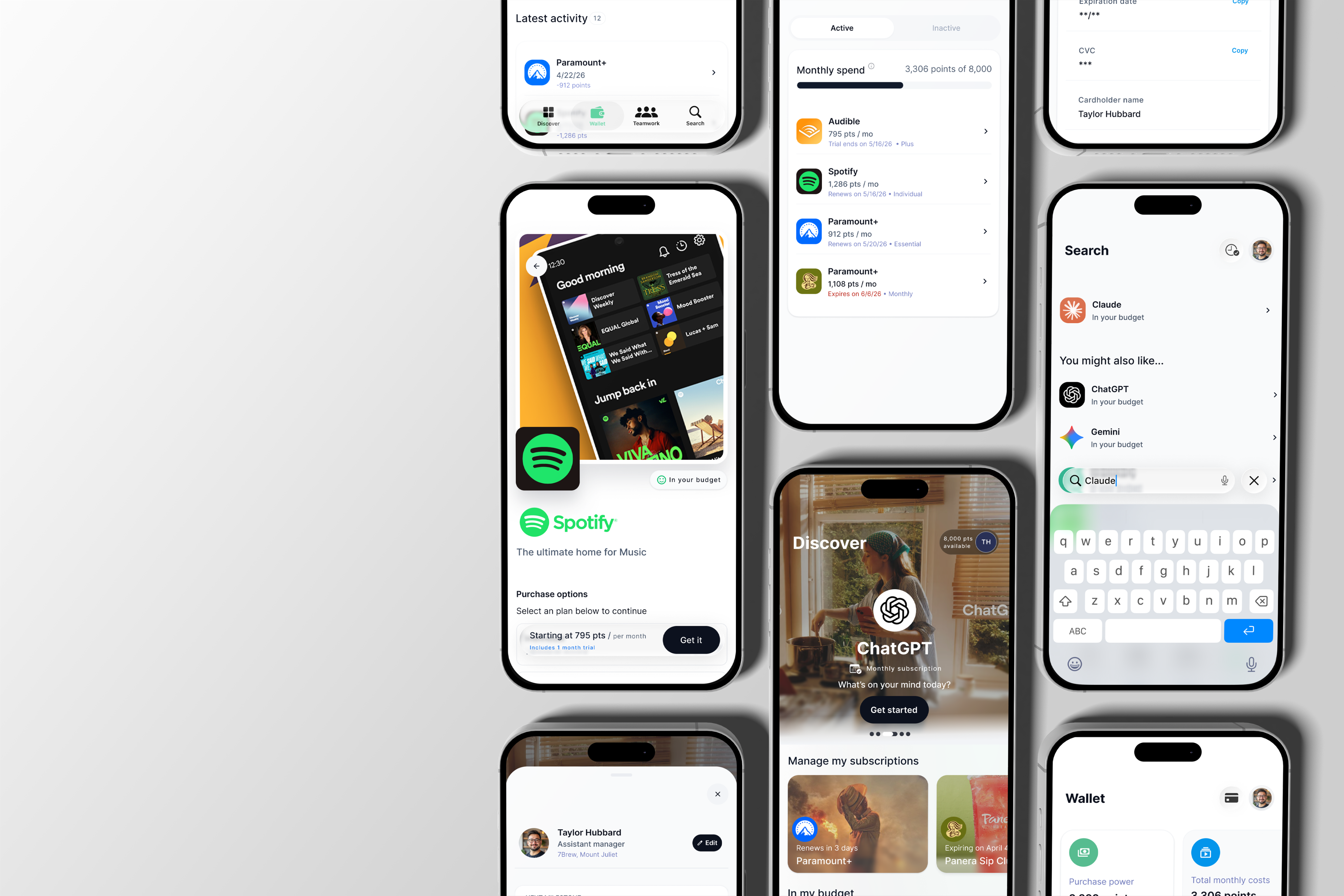
A marketplace that feels like a lifestyle app
Problem
Rewards felt like an HR portal, so nobody browsed them.
What I designed
An editorial Discover feed of brands employees already love, with product detail that explains value in plain language and points always shown against the monthly allocation.
Key decision
Show points as allocation use, never a raw number — “3,000 of 8,000 points available” means something; “6,000 points” doesn’t.
Solution 02
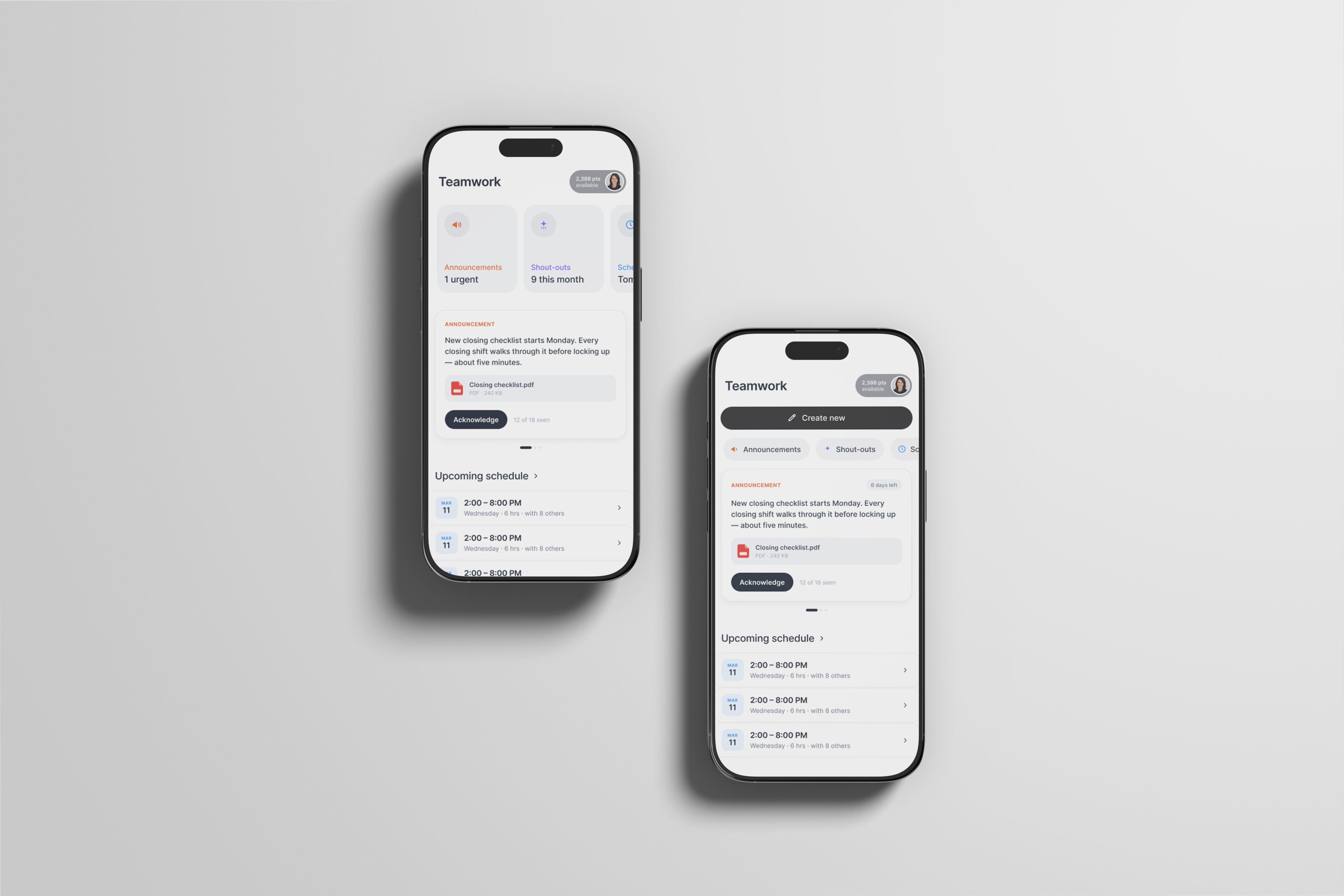
Recognition built for shift teams
Problem
Hourly teams have no Slack or Teams, so announcements and recognition got lost.
What I designed
Teamwork: one hub that mixes announcements, shifts and manager-granted shout-outs on a single timeline, with zones that disappear when empty.
Key decision
No replies and no peer-to-peer messaging. The board stays signal, not noise — and recognition stays meaningful.
Solution 03
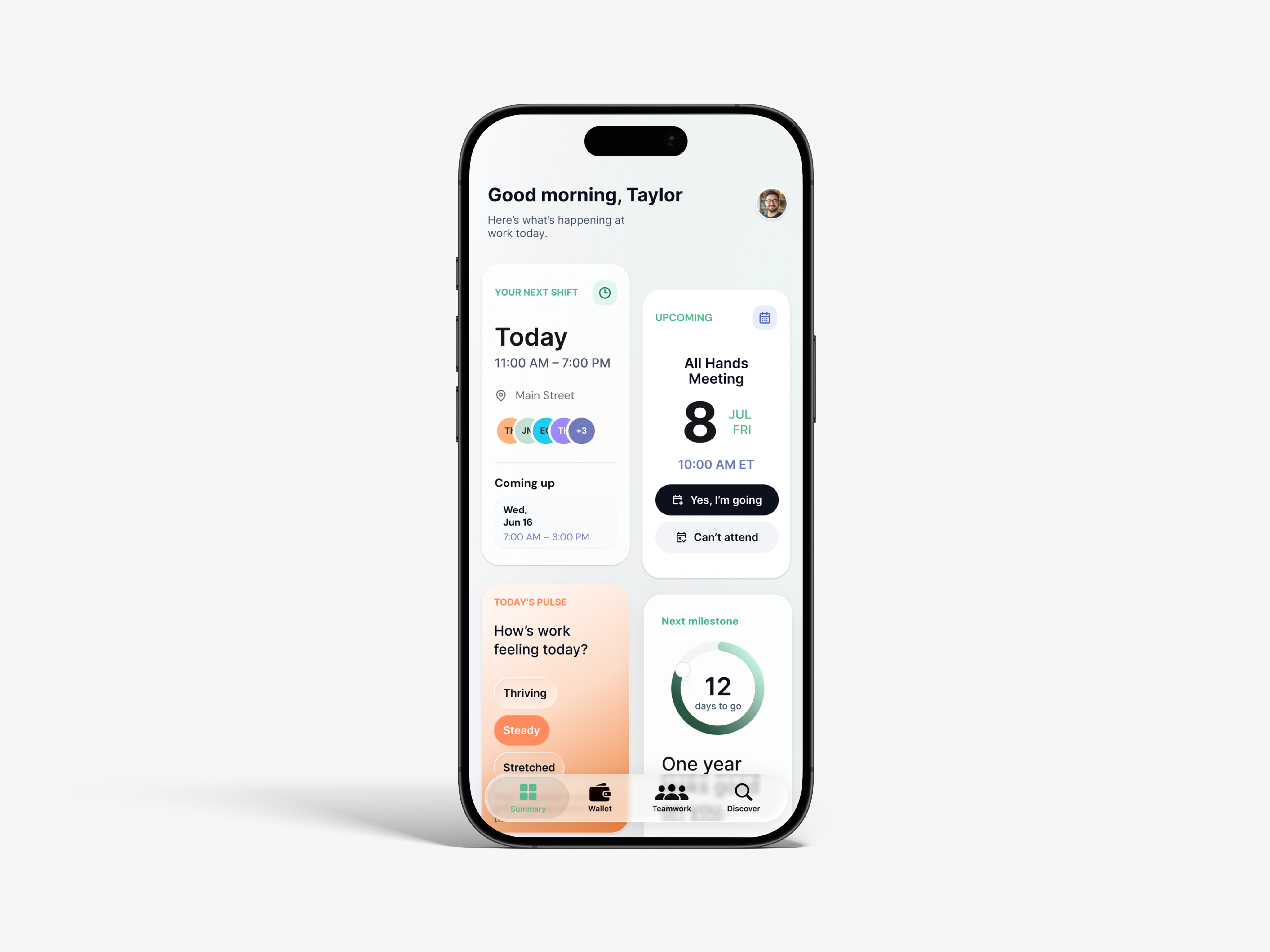
An assistant that shows up before you ask
Problem
Useful things were buried behind taps, mid-shift, with full hands.
What I designed
Signal: an ambient dock on every page — tap to ask, hold to talk — that surfaces the routine you need because you’re on the schedule.
Key decision
Signal never watches. Personalization is manual, and the copy says so — trust over cleverness.
05
The system
The system behind the screens.
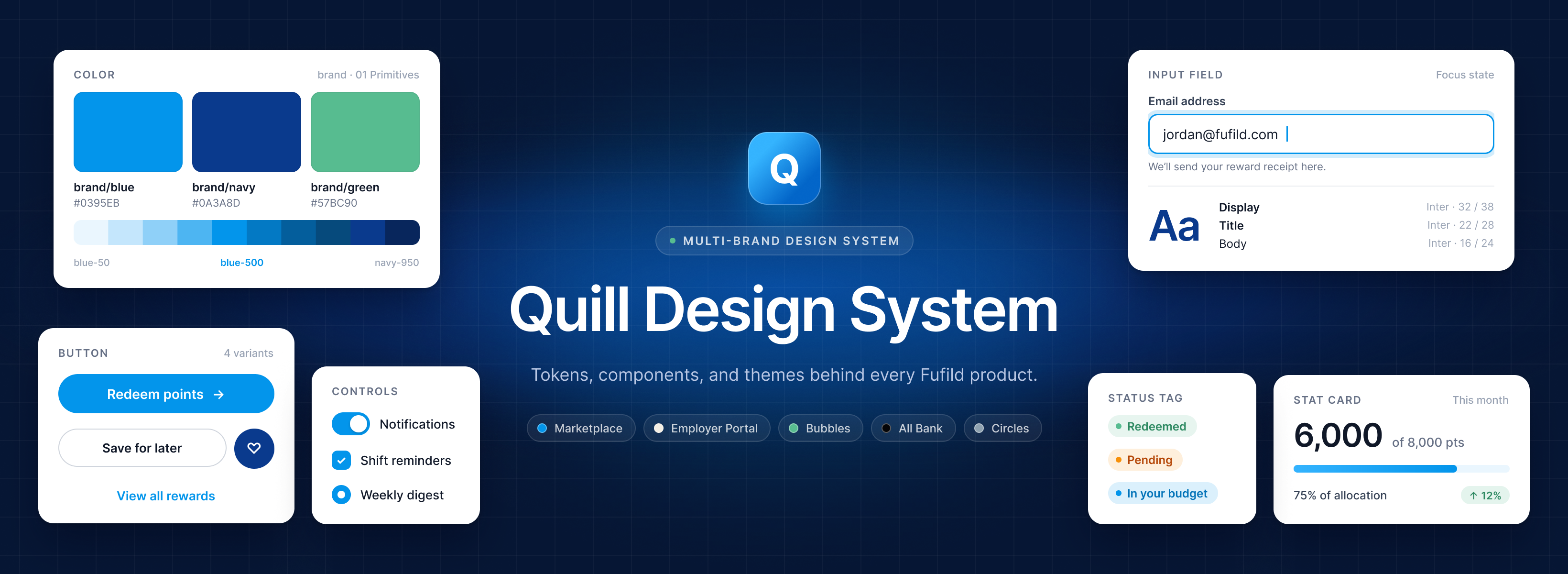
A single good screen is an accident. Marketplace needed a foundation every feature — and every team — could build on without re-deciding the basics.
01
Tokens & variables
Color, type, spacing and elevation as a single source of truth across iOS and Android.
90+ tokens
02
Component library
Composable primitives built up into patterns — cards, tiles, sheets, docks — versioned and documented.
100+ components
03
Interaction patterns
Reusable behaviors, like an opaque trigger that expands into a glass sheet, and zones that disappear when empty.
15+ patterns
04
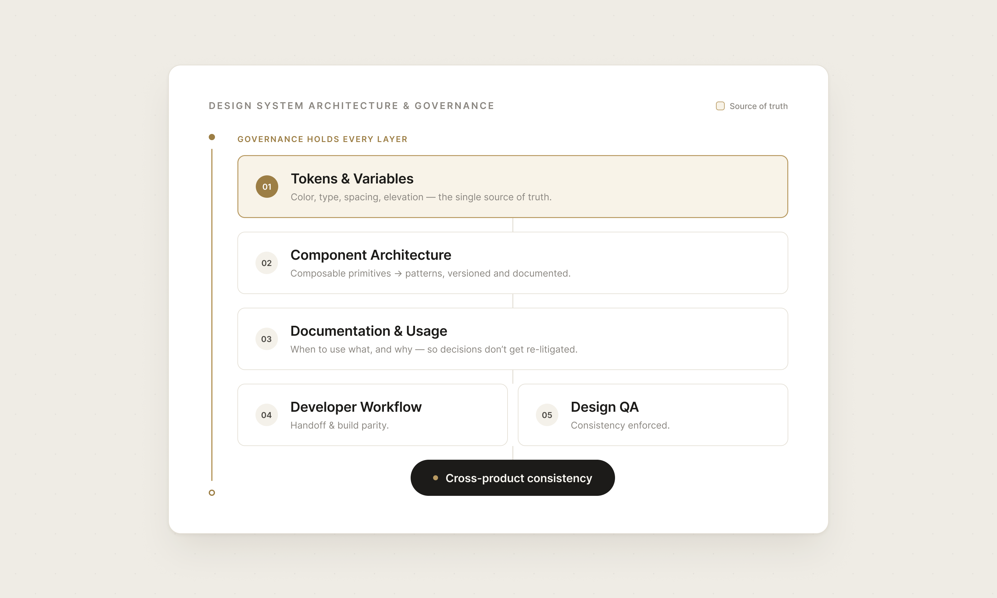
Governance & handoff
Documentation, design QA and a developer workflow that keeps design and build in parity.
4 products, 5th planned
06
Outcomes
What changed because of the work.
Measured against the industry benchmark, in a category most of these employers had never funded before.
45%
Employees actively redeeming monthly points
First QSR deployment, within one month
+10 pts
Above the industry benchmark
35% benchmark for QSR perks platforms
20+
Companies live on the platform
At the time I left the company
0 → 3
Products shipped from scratch
Mobile app and two enterprise portals
Beyond the numbers
—
A shared design language product and engineering both build from
—
Employers who had never funded perks at all now had a program, not a better version of one
—
Employers gained a signal they can act on, not just a spend report
07
Reflection
What this project taught me.
Every product teaches the next product.
What I learned
Simplicity is the result of better decisions, not fewer features.
The strongest moments in Marketplace came from saying no — to replies, to tracking, to raw numbers — rather than from adding anything.
What I’d do differently
Settle the navigation model earlier.
Open questions about where features live cost more the later they’re answered. I’d lock the information architecture before features start competing for it.
The thinking is the product
Let’s build the next thing.
Start a conversation
→
joshuabalderson@gmail.com
linkedin.com/in/…
Based in
Columbus, Ohio
Great interfaces are the outcome. Clear thinking, strong systems, and disciplined execution are the reason they exist.
© 2026 Joshua Balderson
J B
Work
Approach
About
← All work
/
Chapter I — Building products from ambiguity
Marketplace: turning employer benefits into an app people open every day.
A concept with real ambition but no defined shape. I took it from an undefined idea to a mobile-first rewards ecosystem — the product strategy, the flows, and the system that holds it together.
Role
Director of Product Design
Company
Fufild
Platform
iOS • Android • Web
Scope
Strategy · UX · UI · Design system
The challenge
Employees received company benefits but rarely touched them after enrollment. Recognition programs were forgettable, fragmented, and delivered little long-term engagement.
The approach
Rather than add features, design a daily-use mobile experience where every interaction reduces friction, surfaces value quickly, and invites people back.
The outcome
45% of employees actively redeeming monthly points in the first deployment — 10 points above the industry benchmark.
01
Context
An idea with ambition, and nothing else yet.
The thesis was a daily-use app whose every interaction generates behavioral signal that powers an ecosystem around it — rewards, recognition, and the tools people need on shift.
Background
Employers were already paying for benefits and recognition, but the value never reached everyday life. Enrollment happened once, then the benefits disappeared into a portal nobody opened.
There was no system, no flows, and no visual language to build on — every decision was still open. My job was to give the idea a shape: decide what the product is, who it serves first, and the foundation it would grow on.
Who it’s for
Hourly & shift employees
On their feet, phone in pocket, minutes between tasks.
Managers
Need to recognize and inform their team without another tool.
Employers & HR
Fund rewards and need proof they’re landing.
Business goal
Turn employer benefit spend into measurable, everyday engagement — and give employers a signal they can act on.
02
The problem
Employees had benefits. They had no reason to come back to them.
Three problems shaped the product — two in how employees experienced benefits, one in what there was to build on.
01
Invisible after enrollment
Benefits were chosen once and forgotten. Their value never surfaced in the moments people could actually use it.
02
Recognition that didn’t land
Programs were fragmented across tools and generic. Shift teams had no Slack or Teams, so recognition simply got lost.
03
No shape to build on
No system, no flows, no visual language. Without a foundation, every new feature would have been designed from scratch.
03
Process
How the work actually happened.
Business goals → user needs → strategy → system → experience → engineering → production → iteration. The interface was the last 10%.
01
Discover
Mapped the business goals and sat with how shift workers actually use their phones — minutes between tasks, often with full hands.
Artifacts
Stakeholder interviews · Program audit · Goals
02
Define
Framed the core problem as a return-visit problem, not a features problem, and agreed what success would be measured against.
Artifacts
Problem statement · Jobs to be done · Success metrics
03
Explore
Explored competing concepts and placement models side by side, so decisions were made by comparison instead of preference.
Artifacts
Flows · Concept variations · Placement models
04
Systematize
Built the foundation before the screens multiplied — tokens, components and patterns every feature would inherit.
Artifacts
Tokens · Component library · Pattern docs
05
Validate
Put prototypes in front of employees and managers, then iterated on what confused them or slowed them down.
Artifacts
Prototypes · Usability sessions · Iterations
06
Ship
Stayed close to engineering through build — handoff, design QA and parity checks until it was in people’s hands.
Artifacts
Handoff specs · Design QA · Release notes
04
Solutions
Three problems, three product decisions.
Each solution traces back to a problem above. The screens matter less than the decision behind them.
Solution 01
A marketplace that feels like a lifestyle app
Problem
Rewards felt like an HR portal, so nobody browsed them.
What I designed
An editorial Discover feed of brands employees already love, with product detail that explains value in plain language and points always shown against the monthly allocation.
Key decision
Show points as allocation use, never a raw number — “3,000 of 8,000 points available” means something; “6,000 points” doesn’t.
Solution 02
Recognition built for shift teams
Problem
Hourly teams have no Slack or Teams, so announcements and recognition got lost.
What I designed
Teamwork: one hub that mixes announcements, shifts and manager-granted shout-outs on a single timeline, with zones that disappear when empty.
Key decision
No replies and no peer-to-peer messaging. The board stays signal, not noise — and recognition stays meaningful.
Solution 03
An assistant that shows up before you ask
Problem
Useful things were buried behind taps, mid-shift, with full hands.
What I designed
Signal: an ambient dock on every page — tap to ask, hold to talk — that surfaces the routine you need because you’re on the schedule.
Key decision
Signal never watches. Personalization is manual, and the copy says so — trust over cleverness.
05
The system
The system behind the screens.
A single good screen is an accident. Marketplace needed a foundation every feature — and every team — could build on without re-deciding the basics.
01
Tokens & variables
Color, type, spacing and elevation as a single source of truth across iOS and Android.
90+ tokens
02
Component library
Composable primitives built up into patterns — cards, tiles, sheets, docks — versioned and documented.
100+ components
03
Interaction patterns
Reusable behaviors, like an opaque trigger that expands into a glass sheet, and zones that disappear when empty.
15+ patterns
04
Governance & handoff
Documentation, design QA and a developer workflow that keeps design and build in parity.
4 products, 5th planned
06
Outcomes
What changed because of the work.
Measured against the industry benchmark, in a category most of these employers had never funded before.
45%
Employees actively redeeming monthly points
First QSR deployment, within one month
+10 pts
Above the industry benchmark
35% benchmark for QSR perks platforms
20+
Companies live on the platform
At the time I left the company
0 → 3
Products shipped from scratch
Mobile app and two enterprise portals
Beyond the numbers
—
A shared design language product and engineering both build from
—
Employers who had never funded perks at all now had a program, not a better version of one
—
Employers gained a signal they can act on, not just a spend report
07
Reflection
What this project taught me.
Every product teaches the next product.
What I learned
Simplicity is the result of better decisions, not fewer features.
The strongest moments in Marketplace came from saying no — to replies, to tracking, to raw numbers — rather than from adding anything.
What I’d do differently
Settle the navigation model earlier.
Open questions about where features live cost more the later they’re answered. I’d lock the information architecture before features start competing for it.
The thinking is the product
Let’s build the next thing.
Start a conversation
→
joshuabalderson@gmail.com
linkedin.com/in/…
Based in
Columbus, Ohio
Great interfaces are the outcome. Clear thinking, strong systems, and disciplined execution are the reason they exist.
© 2026 Joshua Balderson
J B
Work
Approach
About
← All work
/
Chapter I — Building products from ambiguity
Marketplace: turning employer benefits into an app people open every day.
A concept with real ambition but no defined shape. I took it from an undefined idea to a mobile-first rewards ecosystem — the product strategy, the flows, and the system that holds it together.
Role
Director of Product Design
Company
Fufild
Platform
iOS • Android • Web
Scope
Strategy · UX · UI · Design system
The challenge
Employees received company benefits but rarely touched them after enrollment. Recognition programs were forgettable, fragmented, and delivered little long-term engagement.
The approach
Rather than add features, design a daily-use mobile experience where every interaction reduces friction, surfaces value quickly, and invites people back.
The outcome
45% of employees actively redeeming monthly points in the first deployment — 10 points above the industry benchmark.
01
Context
An idea with ambition, and nothing else yet.
The thesis was a daily-use app whose every interaction generates behavioral signal that powers an ecosystem around it — rewards, recognition, and the tools people need on shift.
Background
Employers were already paying for benefits and recognition, but the value never reached everyday life. Enrollment happened once, then the benefits disappeared into a portal nobody opened.
There was no system, no flows, and no visual language to build on — every decision was still open. My job was to give the idea a shape: decide what the product is, who it serves first, and the foundation it would grow on.
Who it’s for
Hourly & shift employees
On their feet, phone in pocket, minutes between tasks.
Managers
Need to recognize and inform their team without another tool.
Employers & HR
Fund rewards and need proof they’re landing.
Business goal
Turn employer benefit spend into measurable, everyday engagement — and give employers a signal they can act on.
02
The problem
Employees had benefits. They had no reason to come back to them.
Three problems shaped the product — two in how employees experienced benefits, one in what there was to build on.
01
Invisible after enrollment
Benefits were chosen once and forgotten. Their value never surfaced in the moments people could actually use it.
02
Recognition that didn’t land
Programs were fragmented across tools and generic. Shift teams had no Slack or Teams, so recognition simply got lost.
03
No shape to build on
No system, no flows, no visual language. Without a foundation, every new feature would have been designed from scratch.
03
Process
How the work actually happened.
Business goals → user needs → strategy → system → experience → engineering → production → iteration. The interface was the last 10%.
01
Discover
Mapped the business goals and sat with how shift workers actually use their phones — minutes between tasks, often with full hands.
Artifacts
Stakeholder interviews · Program audit · Goals
02
Define
Framed the core problem as a return-visit problem, not a features problem, and agreed what success would be measured against.
Artifacts
Problem statement · Jobs to be done · Success metrics
03
Explore
Explored competing concepts and placement models side by side, so decisions were made by comparison instead of preference.
Artifacts
Flows · Concept variations · Placement models
04
Systematize
Built the foundation before the screens multiplied — tokens, components and patterns every feature would inherit.
Artifacts
Tokens · Component library · Pattern docs
05
Validate
Put prototypes in front of employees and managers, then iterated on what confused them or slowed them down.
Artifacts
Prototypes · Usability sessions · Iterations
06
Ship
Stayed close to engineering through build — handoff, design QA and parity checks until it was in people’s hands.
Artifacts
Handoff specs · Design QA · Release notes
04
Solutions
Three problems, three product decisions.
Each solution traces back to a problem above. The screens matter less than the decision behind them.
Solution 01
A marketplace that feels like a lifestyle app
Problem
Rewards felt like an HR portal, so nobody browsed them.
What I designed
An editorial Discover feed of brands employees already love, with product detail that explains value in plain language and points always shown against the monthly allocation.
Key decision
Show points as allocation use, never a raw number — “3,000 of 8,000 points available” means something; “6,000 points” doesn’t.
Solution 02
Recognition built for shift teams
Problem
Hourly teams have no Slack or Teams, so announcements and recognition got lost.
What I designed
Teamwork: one hub that mixes announcements, shifts and manager-granted shout-outs on a single timeline, with zones that disappear when empty.
Key decision
No replies and no peer-to-peer messaging. The board stays signal, not noise — and recognition stays meaningful.
Solution 03
An assistant that shows up before you ask
Problem
Useful things were buried behind taps, mid-shift, with full hands.
What I designed
Signal: an ambient dock on every page — tap to ask, hold to talk — that surfaces the routine you need because you’re on the schedule.
Key decision
Signal never watches. Personalization is manual, and the copy says so — trust over cleverness.
05
The system
The system behind the screens.
A single good screen is an accident. Marketplace needed a foundation every feature — and every team — could build on without re-deciding the basics.
01
Tokens & variables
Color, type, spacing and elevation as a single source of truth across iOS and Android.
90+ tokens
02
Component library
Composable primitives built up into patterns — cards, tiles, sheets, docks — versioned and documented.
100+ components
03
Interaction patterns
Reusable behaviors, like an opaque trigger that expands into a glass sheet, and zones that disappear when empty.
15+ patterns
04
Governance & handoff
Documentation, design QA and a developer workflow that keeps design and build in parity.
4 products, 5th planned
06
Outcomes
What changed because of the work.
Measured against the industry benchmark, in a category most of these employers had never funded before.
45%
Employees actively redeeming monthly points
First QSR deployment, within one month
+10 pts
Above the industry benchmark
35% benchmark for QSR perks platforms
20+
Companies live on the platform
At the time I left the company
0 → 3
Products shipped from scratch
Mobile app and two enterprise portals
Beyond the numbers
—
A shared design language product and engineering both build from
—
Employers who had never funded perks at all now had a program, not a better version of one
—
Employers gained a signal they can act on, not just a spend report
07
Reflection
What this project taught me.
Every product teaches the next product.
What I learned
Simplicity is the result of better decisions, not fewer features.
The strongest moments in Marketplace came from saying no — to replies, to tracking, to raw numbers — rather than from adding anything.
What I’d do differently
Settle the navigation model earlier.
Open questions about where features live cost more the later they’re answered. I’d lock the information architecture before features start competing for it.
The thinking is the product
Let’s build the next thing.
Start a conversation
→
joshuabalderson@gmail.com
linkedin.com/in/…
Based in
Columbus, Ohio
Great interfaces are the outcome. Clear thinking, strong systems, and disciplined execution are the reason they exist.
© 2026 Joshua Balderson