J B
Menu
← All work
/
Chapter II — Building systems that scale
Company-wide design systems: the foundation an entire product family inherits.
Two company-wide design systems, built from opposite starting points. Quill at Fufild from nothing, and a system at Comply365 rebuilt from a legacy platform that reused almost nothing. This is how each was built, and what the two taught me about when to create and when to consolidate.
Role
Design system architect & owner
Company
Fufild, Comply365
Platform
Web · iOS · Android
Timeline
2021 – 2026
Scope
Tokens · Components · Docs · Governance
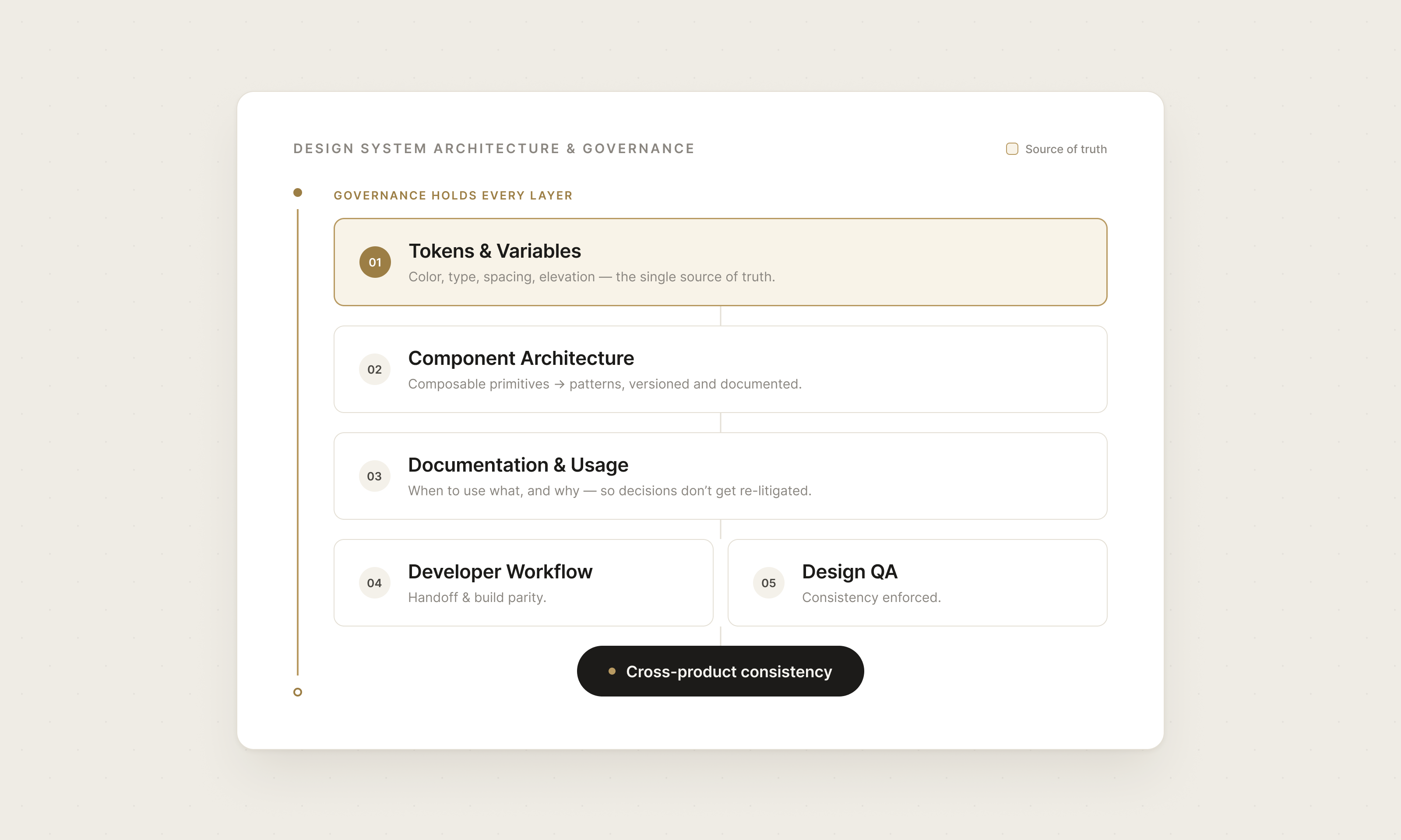
The challenge
One product had no system, no palette and no components. The other had years of interface with no reuse, where the same element existed in a dozen slightly different forms.
The approach
Tokens first at Fufild. Audit first at Comply365. Both ended in patterns that decide how every page gets built.
The outcome
Two company-wide systems: 160 components, 90+ tokens, and the patterns that decide how every page gets built.
01
Fufild · from scratch
Nothing existed yet, so the system came first.
No palette, no components, no product. Building the system and the first screens at the same time meant every decision had to be reusable before it was final.
How it started
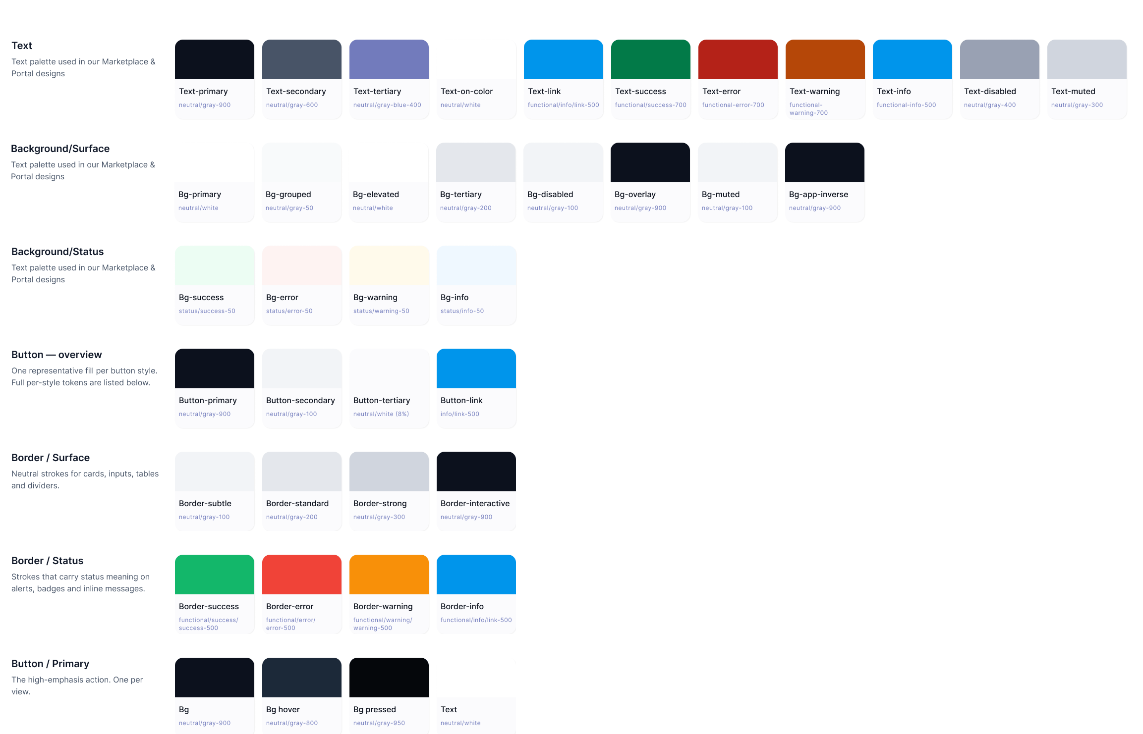
I started with tokens: primitives first, then semantics. The color palette and type were locked early, because everything built afterward would inherit them. Getting those wrong later means rebuilding everything above them. The system became Quill.
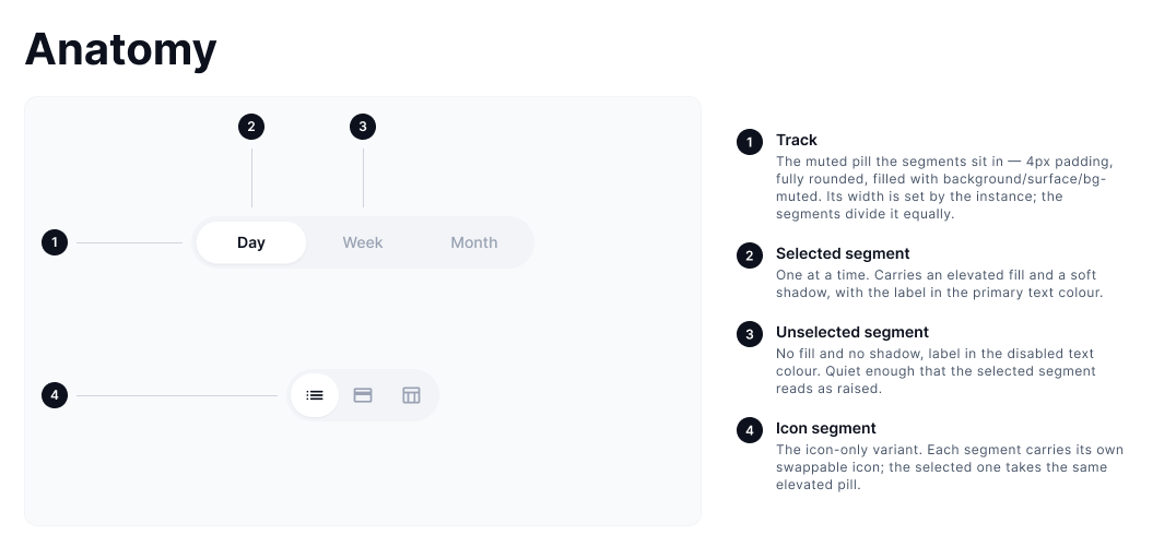
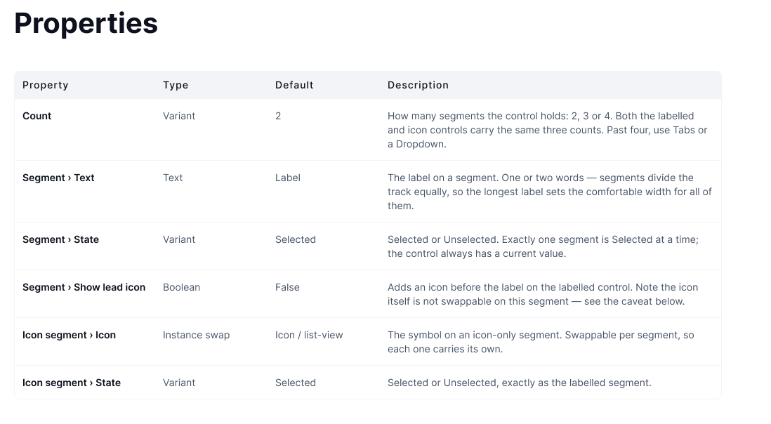
Then the components I knew every page would need: navbar, toolbar, buttons, segmented controls, toggles, input fields. I built them from scratch rather than starting from Material Design or Human Interface Guidelines. I wanted a Fufild toggle and a Fufild button, not a themed copy of someone else's.
How it grew
Tokens before anything
Primitives, then semantics. Palette and type settled before a single component existed.
Components from scratch
Navbar, toolbar, buttons, segmented controls, toggles, inputs. Built, not borrowed.
Patterns found in the work
Designing complex pages surfaced components that would recur. I built each one the moment I recognized it, so the next page already had it. That became the practice: 100+ components and 90+ tokens, with 15 to 20 patterns.
02
Quill · one system, three products
One system, a mobile app and two desktop portals.
Fufild was never one product. Quill had to serve a React Native app for employees and two web portals for managers and employers, without collapsing into a lowest common denominator.
The hard part
Primitives stayed shared across everything. Semantics were defined separately for each platform, so a surface, an action or a state could mean the right thing on mobile and on web without duplicating the palette underneath.
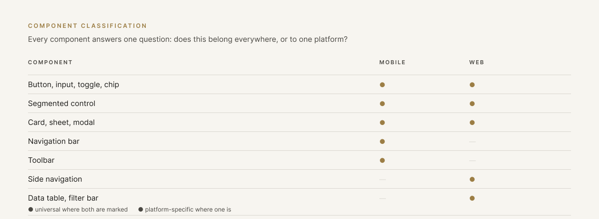
Then every component had to be classified: does this work everywhere, or does it belong to one platform? Buttons, inputs, toggles and segmented controls were universal. Navigation, toolbars and touch-specific patterns were not, and pretending otherwise would have made both platforms worse.
How it was split
Shared primitives
One palette, one type scale, one spacing system underneath every product.
Semantics per platform
Separate semantic layers for mobile and web, so the same primitive resolves correctly in each context.
Universal or platform-specific
Every component classified by where it belongs. That decision is what let one system serve four products with a fifth planned, instead of three systems drifting apart.
03
Comply365 · from legacy
A platform with years of interface and almost no reuse.
Every page carried its own version of the same component. The work was an audit first, then modernization, then the patterns that gave the whole platform a structure. Roughly 60 components, and 20 to 30 pattern variations.
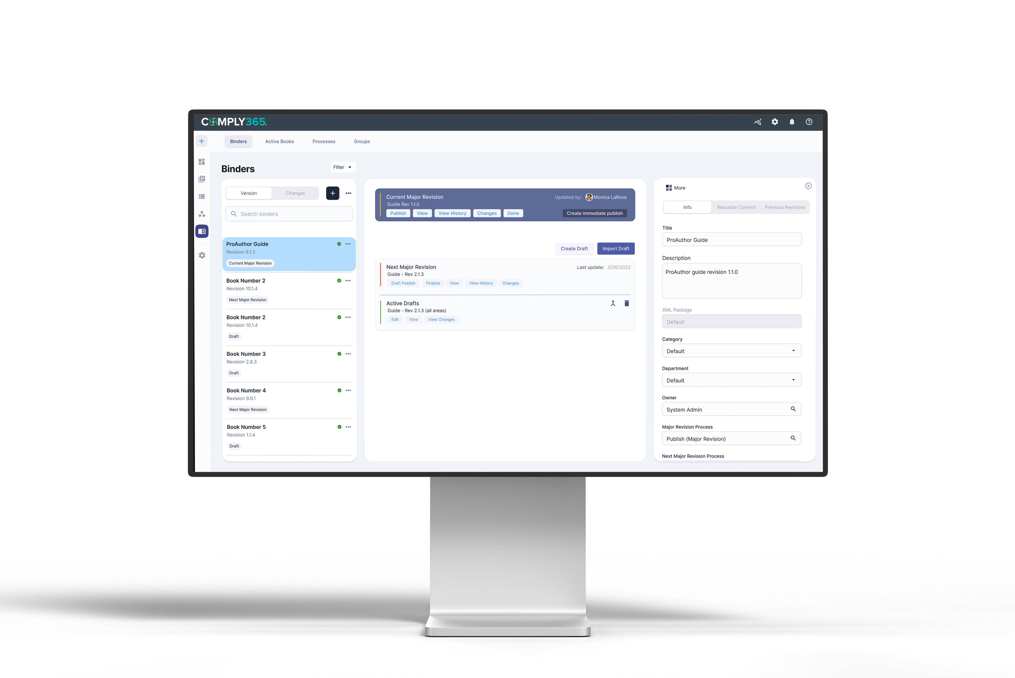
Image placeholder — Token architecture / variables overview
Step 01
Audit before anything gets built
Problem
Nothing was reused. The same button existed in a dozen slightly different forms across the platform.
What I designed
A full inventory of the legacy interface, marking what could be reused as-is, what needed consolidating, and what was genuinely one-off.
Key decision
Consolidate before creating. Most of what the platform needed already existed somewhere in it.
Image placeholder — Component library sheet
Step 02
Modernize instead of rebuild
Problem
Components looked dated, but rebuilding all of them would have cost months and broken parity with the existing build.
What I designed
Modernized the existing components against updated criteria. Buttons had no border radius; setting it to 4px made the interface feel current without touching anything structural.
Key decision
The smallest change that reads as new. Freshness came from criteria, not from starting over.
Image placeholder — Documentation page + governance workflow
Step 03
Pattern the platform on panels
Problem
Pages were designed one at a time, so people lost key details moving between documents, comparing them, or making edits.
What I designed
A panel system as the baseline for every page. A second audit through information architecture decided which pages needed three panels, which needed two, and which needed a single core panel.
Key decision
Every page inherits a panel structure. That let the system breathe and kept the details visible while people compared and edited documents.
04
The practice
Two starting points, one repeatable sequence.
Whether the system starts from nothing or from a decade of accumulated interface, the order of the work stays the same.
Business goal
Let the organization scale its quality, not just its headcount.
How the work went
01
Audit
Inventoried existing UI across products to find duplication, drift, and the patterns worth keeping.
Artifacts
UI inventory · Drift audit · Pattern map
02
Define
Set principles, ownership and contribution rules before building a single component.
Artifacts
Principles · Ownership model · Contribution flow
03
Foundations
Built tokens and variables as the single source of truth for color, type, spacing and elevation.
Artifacts
Token architecture · Variables · Themes
04
Components
Composed primitives into patterns — versioned and documented, never rebuilt from scratch.
Artifacts
Primitives · Patterns · Versioning
05
Document
Wrote down when to use what, and why, so decisions stop getting re-litigated.
Artifacts
Usage guidelines · Do’s & don’ts · Examples
06
Govern
Connected design QA and developer workflow so consistency is enforced, not hoped for.
Artifacts
Design QA · Handoff · Release process
Beyond the numbers
—
Cross-product consistency without reviewing every screen
—
Decisions documented once instead of re-litigated in critique
—
Two company-wide systems built from inception
Next case study — Chapter III
Simplifying Enterprise Complexity
Read case study
→
Open to new opportunities
Let’s build the next thing.
Start a conversation
→
joshuabalderson@gmail.com
linkedin.com/in/joshua-balderson
Based in
Columbus, Ohio
Fifteen years designing for regulated, operationally complex industries: aviation, healthcare, financial services, and employee benefits.
© 2026 Joshua Balderson
J B
Work
Approach
About
← All work
/
Chapter II — Building systems that scale
Company-wide design systems: the foundation an entire product family inherits.
Two company-wide design systems, built from opposite starting points. Quill at Fufild from nothing, and a system at Comply365 rebuilt from a legacy platform that reused almost nothing. This is how each was built, and what the two taught me about when to create and when to consolidate.
Role
Design system architect & owner
Company
Fufild, Comply365
Platform
Web · iOS · Android
Timeline
2021 – 2026
Scope
Tokens · Components · Docs · Governance
The challenge
One product had no system, no palette and no components. The other had years of interface with no reuse, where the same element existed in a dozen slightly different forms.
The approach
Tokens first at Fufild. Audit first at Comply365. Both ended in patterns that decide how every page gets built.
The outcome
Two company-wide systems: 160 components, 90+ tokens, and the patterns that decide how every page gets built.
01
Fufild · from scratch
Nothing existed yet, so the system came first.
No palette, no components, no product. Building the system and the first screens at the same time meant every decision had to be reusable before it was final.
How it started
I started with tokens: primitives first, then semantics. The color palette and type were locked early, because everything built afterward would inherit them. Getting those wrong later means rebuilding everything above them. The system became Quill.
Then the components I knew every page would need: navbar, toolbar, buttons, segmented controls, toggles, input fields. I built them from scratch rather than starting from Material Design or Human Interface Guidelines. I wanted a Fufild toggle and a Fufild button, not a themed copy of someone else's.
How it grew
Tokens before anything
Primitives, then semantics. Palette and type settled before a single component existed.
Components from scratch
Navbar, toolbar, buttons, segmented controls, toggles, inputs. Built, not borrowed.
Patterns found in the work
Designing complex pages surfaced components that would recur. I built each one the moment I recognized it, so the next page already had it. That became the practice: 100+ components and 90+ tokens, with 15 to 20 patterns.
02
Quill · one system, three products
One system, a mobile app and two desktop portals.
Fufild was never one product. Quill had to serve a React Native app for employees and two web portals for managers and employers, without collapsing into a lowest common denominator.
The hard part
Primitives stayed shared across everything. Semantics were defined separately for each platform, so a surface, an action or a state could mean the right thing on mobile and on web without duplicating the palette underneath.
Then every component had to be classified: does this work everywhere, or does it belong to one platform? Buttons, inputs, toggles and segmented controls were universal. Navigation, toolbars and touch-specific patterns were not, and pretending otherwise would have made both platforms worse.
How it was split
Shared primitives
One palette, one type scale, one spacing system underneath every product.
Semantics per platform
Separate semantic layers for mobile and web, so the same primitive resolves correctly in each context.
Universal or platform-specific
Every component classified by where it belongs. That decision is what let one system serve four products with a fifth planned, instead of three systems drifting apart.
03
Comply365 · from legacy
A platform with years of interface and almost no reuse.
Every page carried its own version of the same component. The work was an audit first, then modernization, then the patterns that gave the whole platform a structure. Roughly 60 components, and 20 to 30 pattern variations.
Image placeholder — Token architecture / variables overview
Step 01
Audit before anything gets built
Problem
Nothing was reused. The same button existed in a dozen slightly different forms across the platform.
What I designed
A full inventory of the legacy interface, marking what could be reused as-is, what needed consolidating, and what was genuinely one-off.
Key decision
Consolidate before creating. Most of what the platform needed already existed somewhere in it.
Image placeholder — Component library sheet
Step 02
Modernize instead of rebuild
Problem
Components looked dated, but rebuilding all of them would have cost months and broken parity with the existing build.
What I designed
Modernized the existing components against updated criteria. Buttons had no border radius; setting it to 4px made the interface feel current without touching anything structural.
Key decision
The smallest change that reads as new. Freshness came from criteria, not from starting over.
Image placeholder — Documentation page + governance workflow
Step 03
Pattern the platform on panels
Problem
Pages were designed one at a time, so people lost key details moving between documents, comparing them, or making edits.
What I designed
A panel system as the baseline for every page. A second audit through information architecture decided which pages needed three panels, which needed two, and which needed a single core panel.
Key decision
Every page inherits a panel structure. That let the system breathe and kept the details visible while people compared and edited documents.
04
The practice
Two starting points, one repeatable sequence.
Whether the system starts from nothing or from a decade of accumulated interface, the order of the work stays the same.
Business goal
Let the organization scale its quality, not just its headcount.
How the work went
01
Audit
Inventoried existing UI across products to find duplication, drift, and the patterns worth keeping.
Artifacts
UI inventory · Drift audit · Pattern map
02
Define
Set principles, ownership and contribution rules before building a single component.
Artifacts
Principles · Ownership model · Contribution flow
03
Foundations
Built tokens and variables as the single source of truth for color, type, spacing and elevation.
Artifacts
Token architecture · Variables · Themes
04
Components
Composed primitives into patterns — versioned and documented, never rebuilt from scratch.
Artifacts
Primitives · Patterns · Versioning
05
Document
Wrote down when to use what, and why, so decisions stop getting re-litigated.
Artifacts
Usage guidelines · Do’s & don’ts · Examples
06
Govern
Connected design QA and developer workflow so consistency is enforced, not hoped for.
Artifacts
Design QA · Handoff · Release process
Beyond the numbers
—
Cross-product consistency without reviewing every screen
—
Decisions documented once instead of re-litigated in critique
—
Two company-wide systems built from inception
Next case study — Chapter III
Simplifying Enterprise Complexity
Read case study
→
Open to new opportunities
Let’s build the next thing.
Let’s connect
→
joshuabalderson@gmail.com
linkedin.com/in/joshua-balderson
Based in
Columbus, Ohio
Fifteen years designing for regulated, operationally complex industries: aviation, healthcare, financial services, and employee benefits.
© 2026 Joshua Balderson
J B
Work
Approach
About
← All work
/
Chapter II — Building systems that scale
Company-wide design systems: the foundation an entire product family inherits.
Two company-wide design systems, built from opposite starting points. Quill at Fufild from nothing, and a system at Comply365 rebuilt from a legacy platform that reused almost nothing. This is how each was built, and what the two taught me about when to create and when to consolidate.
Role
Design system architect & owner
Company
Fufild, Comply365
Platform
Web · iOS · Android
Timeline
2021 — 2026
Scope
Tokens · Components · Docs · Governance
The challenge
One product had no system, no palette and no components. The other had years of interface with no reuse, where the same element existed in a dozen slightly different forms.
The approach
Tokens first at Fufild. Audit first at Comply365. Both ended in patterns that decide how every page gets built.
The outcome
Two company-wide systems: 160 components, 90+ tokens, and the patterns that decide how every page gets built.
01
Fufild · from scratch
Nothing existed yet, so the system came first.
No palette, no components, no product. Building the system and the first screens at the same time meant every decision had to be reusable before it was final.
How it started
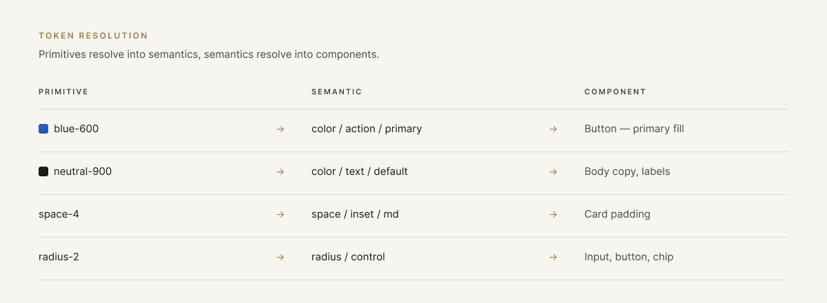
I started with tokens: primitives first, then semantics. The color palette and type were locked early, because everything built afterward would inherit them. Getting those wrong later means rebuilding everything above them. The system became Quill.
Then the components I knew every page would need: navbar, toolbar, buttons, segmented controls, toggles, input fields. I built them from scratch rather than starting from Material Design or Human Interface Guidelines. I wanted a Fufild toggle and a Fufild button, not a themed copy of someone else's.
How it grew
Tokens before anything
Primitives, then semantics. Palette and type settled before a single component existed.
Components from scratch
Navbar, toolbar, buttons, segmented controls, toggles, inputs. Built, not borrowed.
Patterns found in the work
Designing complex pages surfaced components that would recur. I built each one the moment I recognized it, so the next page already had it. That became the practice: 100+ components and 90+ tokens, with 15 to 20 patterns.
02
Quill · one system, three products
One system, a mobile app and two desktop portals.
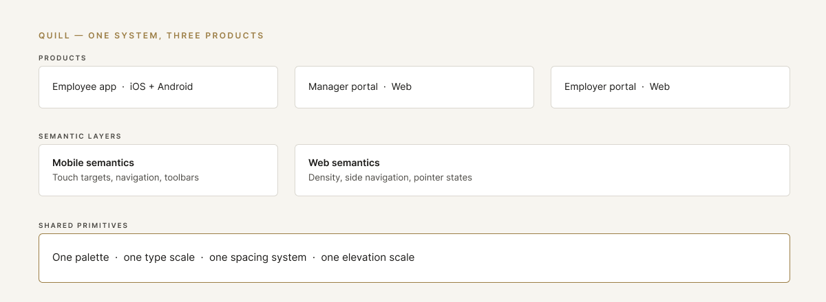
Fufild was never one product. Quill had to serve a React Native app for employees and two web portals for managers and employers, without collapsing into a lowest common denominator.

Q

MULTI-BRAND DESIGN SYSTEM
Quill Design System
Tokens, components, and themes behind every Fufild product.

Marketplace

Employer Portal
Color
brand · 01 Primitives
brand/blue
#0395EB
brand/navy
#0A3A8D
brand/green
#57BC90
blue-50
blue-500
navy-950
Button
4 variants
Redeem points
→
Save for later
♡
View all rewards
Controls

Notifications
✓
Shift reminders
Weekly digest
Input field
Focus state
Email address
jordan@fufild.com
We’ll send your reward receipt here.
Aa
Display
Inter · 32 / 38
Title
Inter · 22 / 28
Body
Inter · 16 / 24
Stat card
This month
6,000
of 8,000 pts
75% of allocation
↑ 12%
Status tag
Redeemed

Pending

In your budget
The hard part
Primitives stayed shared across everything. Semantics were defined separately for each platform, so a surface, an action or a state could mean the right thing on mobile and on web without duplicating the palette underneath.
Then every component had to be classified: does this work everywhere, or does it belong to one platform? Buttons, inputs, toggles and segmented controls were universal. Navigation, toolbars and touch-specific patterns were not, and pretending otherwise would have made both platforms worse.
How it was split
Shared primitives
One palette, one type scale, one spacing system underneath every product.
Semantics per platform
Separate semantic layers for mobile and web, so the same primitive resolves correctly in each context.
Universal or platform-specific
Every component classified by where it belongs. That decision is what let one system serve four products with a fifth planned, instead of three systems drifting apart.
03
Comply365 · from legacy
A platform with years of interface and almost no reuse.
Every page carried its own version of the same component. The work was an audit first, then modernization, then the patterns that gave the whole platform a structure. Roughly 60 components, and 20 to 30 pattern variations.
Step 01
Audit before anything gets built
Problem
Nothing was reused. The same button existed in a dozen slightly different forms across the platform.
What I designed
A full inventory of the legacy interface, marking what could be reused as-is, what needed consolidating, and what was genuinely one-off.
Key decision
Consolidate before creating. Most of what the platform needed already existed somewhere in it.
Step 02
Modernize instead of rebuild
Problem
Components looked dated, but rebuilding all of them would have cost months and broken parity with the existing build.
What I designed
Modernized the existing components against updated criteria. Buttons had no border radius; setting it to 4px made the interface feel current without touching anything structural.
Key decision
The smallest change that reads as new. Freshness came from criteria, not from starting over.
Step 03
Pattern the platform on panels
Problem
Pages were designed one at a time, so people lost key details moving between documents, comparing them, or making edits.
What I designed
A panel system as the baseline for every page. A second audit through information architecture decided which pages needed three panels, which needed two, and which needed a single core panel.
Key decision
Every page inherits a panel structure. That let the system breathe and kept the details visible while people compared and edited documents.
04
The practice
Two starting points, one repeatable sequence.
Whether the system starts from nothing or from a decade of accumulated interface, the order of the work stays the same.
Business goal
Let the organization scale its quality, not just its headcount.
How the work went
01
Audit
Inventoried existing UI across products to find duplication, drift, and the patterns worth keeping.
Artifacts
UI inventory · Drift audit · Pattern map
02
Define
Set principles, ownership and contribution rules before building a single component.
Artifacts
Principles · Ownership model · Contribution flow
03
Foundations
Built tokens and variables as the single source of truth for color, type, spacing and elevation.
Artifacts
Token architecture · Variables · Themes
04
Components
Composed primitives into patterns, versioned and documented, never rebuilt from scratch.
Artifacts
Primitives · Patterns · Versioning
05
Document
Wrote down when to use what, and why, so decisions stop getting re-litigated.
Artifacts
Usage guidelines · Do’s & don’ts · Examples
06
Govern
Connected design QA and developer workflow so consistency is enforced, not hoped for.
Artifacts
Design QA · Handoff · Release process
Beyond the numbers
—
Cross-product consistency without reviewing every screen
—
Decisions documented once instead of re-litigated in critique
—
Engineers stopped guessing which component belonged where
Open to new opportunities
Let’s build the next thing.
Let’s connect
→
joshuabalderson@gmail.com
linkedin.com/in/joshua-balderson
Based in
Columbus, Ohio
Fifteen years designing for regulated, operationally complex industries: aviation, healthcare, financial services, and employee benefits.
© 2026 Joshua Balderson