J B
Menu
← All work
/
Chapter III — Simplifying enterprise complexity
Comply365: reorganizing airline compliance software so the right path is the obvious one.
Airline compliance software held years of operational knowledge, but the interface buried it. Rather than removing complexity, I reorganized it: predictable navigation, actionable dashboards, and repeatable patterns for data-heavy work.
Role
Lead Designer
Company
Comply365
Industry
Aviation
Timeline
2021 – 2024
Scope
Navigation · Dashboards · Workflow patterns
The challenge
Years of operational knowledge buried behind dense navigation, disconnected workflows, and information-heavy screens that slowed everyday work.
The approach
Reorganize instead of remove: predictable navigation, dashboards people act from, and data-heavy workflows redesigned into repeatable patterns.
The outcome
More than half of accounts migrated to the new experience within months, with the legacy interface still running and migration entirely optional.
01
Context
Years of operational knowledge, buried in the interface.
Enterprise software doesn't have to feel like enterprise software. The value was already in the platform. People just couldn't reach it quickly.
Background
Comply365 is airline compliance software. It had grown over years to hold the documents, tasks and operational knowledge airline teams depend on. The depth was never the problem.
Whether designing dashboards or administrative workflows, the goal was the same: reduce friction, improve clarity, and make a complex system feel intuitive without losing anything it could do.
Who it’s for
Airline operations teams
Need the right document fast, in the middle of real operational work.
Compliance managers
Track what is done, what is due, and what needs action.
Administrators
Configure and maintain a platform that has grown over years.
02
The problem
Built to show one thing at a time, for a job that needs several.
Three frictions shaped the redesign. The second one came straight out of a Customer Advisory Board session.
01
One item at a time
Opening a document from a list replaced the list. Reviewing several documents in one sitting meant clicking back and forth constantly.
Evidence — workflow mapping across document review tasks
02
Twenty browser tabs
Every document opened in a new browser tab. People kept twenty open at once and had to remember what each one held.
Evidence — Customer Advisory Board sessions with American Airlines, Southwest and NetJets
03
No sense of priority
Nothing signalled which documents needed approval, how urgent they were, or what the next action was.
Evidence — dashboard audit and advisory board feedback
Business goal
Make everyday compliance work faster and clearer, without removing the depth airlines rely on.
How the work went
01
Discover
Mapped where the platform’s operational knowledge lived, and where people lost time reaching it.
Artifacts
Workflow mapping · Heuristic audit · Interviews
02
Define
Framed the problem as organization, not volume. Keep the complexity, change its structure.
Artifacts
Problem framing · IA audit · Priorities
03
Explore
Explored navigation and layout models against real, data-heavy screens rather than ideal ones.
Artifacts
Navigation concepts · Layout explorations
04
Systematize
Turned the strongest approaches into three repeatable patterns that scaled across the platform.
Artifacts
3-tier nav · Card patterns · Three-panel layout
05
Validate
Ran the patterns past the Customer Advisory Board and iterated on what slowed people down.
Artifacts
Prototypes · Usability sessions · Iterations
06
Ship
Rolled the patterns out across the platform alongside engineering.
Artifacts
Specs · Design QA · Rollout plan
03
Research · the advisory board
The workarounds became the requirements.
I ran a Customer Advisory Board of 16–20 executives and operators from American Airlines, Southwest and NetJets, and many more; meeting every two weeks.
How the sessions ran
Each session opened with design updates for feedback and closed with a knowledge share, where customers walked through how they actually used the legacy system day to day.
The second half mattered more. Every company had invented its own workflows to make the old system bearable, and no two did it the same way. Those workarounds were the clearest statement of what the platform should have been doing.
What I did with it
Watch the workaround
Customers walked through the sequences they had invented to get through the legacy system.
Find the need underneath
A workaround is a symptom. The question was what job it was doing, and why the platform forced them into it.
Architect it in
The need became a designed construct in the new system, so the workaround stopped being necessary. The three-panel model came out of exactly this.
04
Solutions
Two overhauls: how documents are read, and where work begins.
The panel changed document review. The dashboard changed what people see first. Everything else followed from those two.
Overhaul 01
The three-panel reading model
Problem
Opening a document replaced the list, and each one spawned a browser tab. Reviewing several documents meant constant back-and-forth and twenty tabs nobody could tell apart.
What I designed
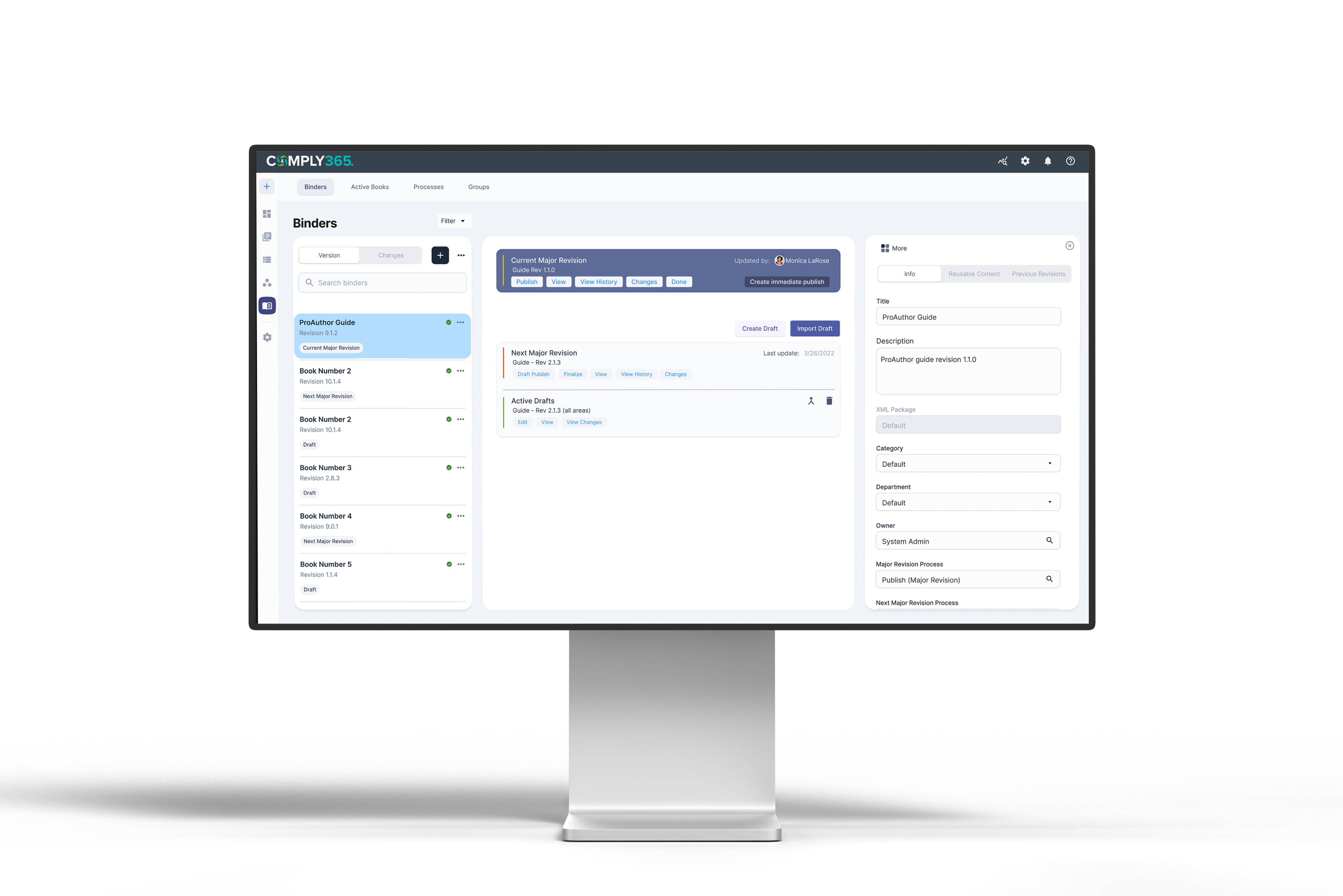
A left panel holding the document list, a centre panel that displays the selected document instantly, and a third panel that opens on demand for metadata. Structured left to right, with one click to close everything and move to the next document.
Key decision
No new tabs, ever. The panel replaced the browser as the place people keep their context.
Overhaul 02
A dashboard that ranks the work
Problem
The legacy homepage treated every document the same. Nothing showed what needed approval, how urgent it was, or what to do with it.
What I designed
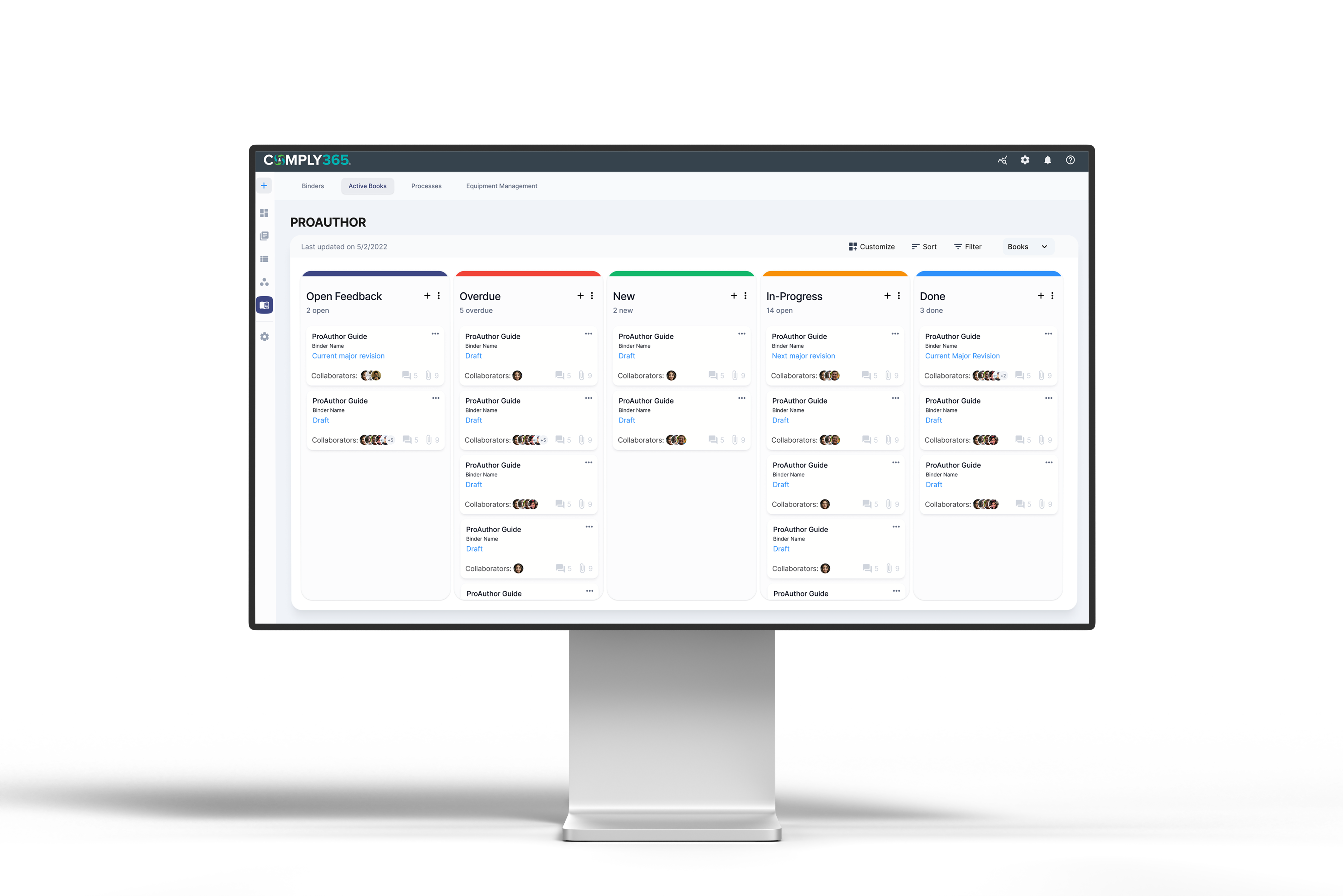
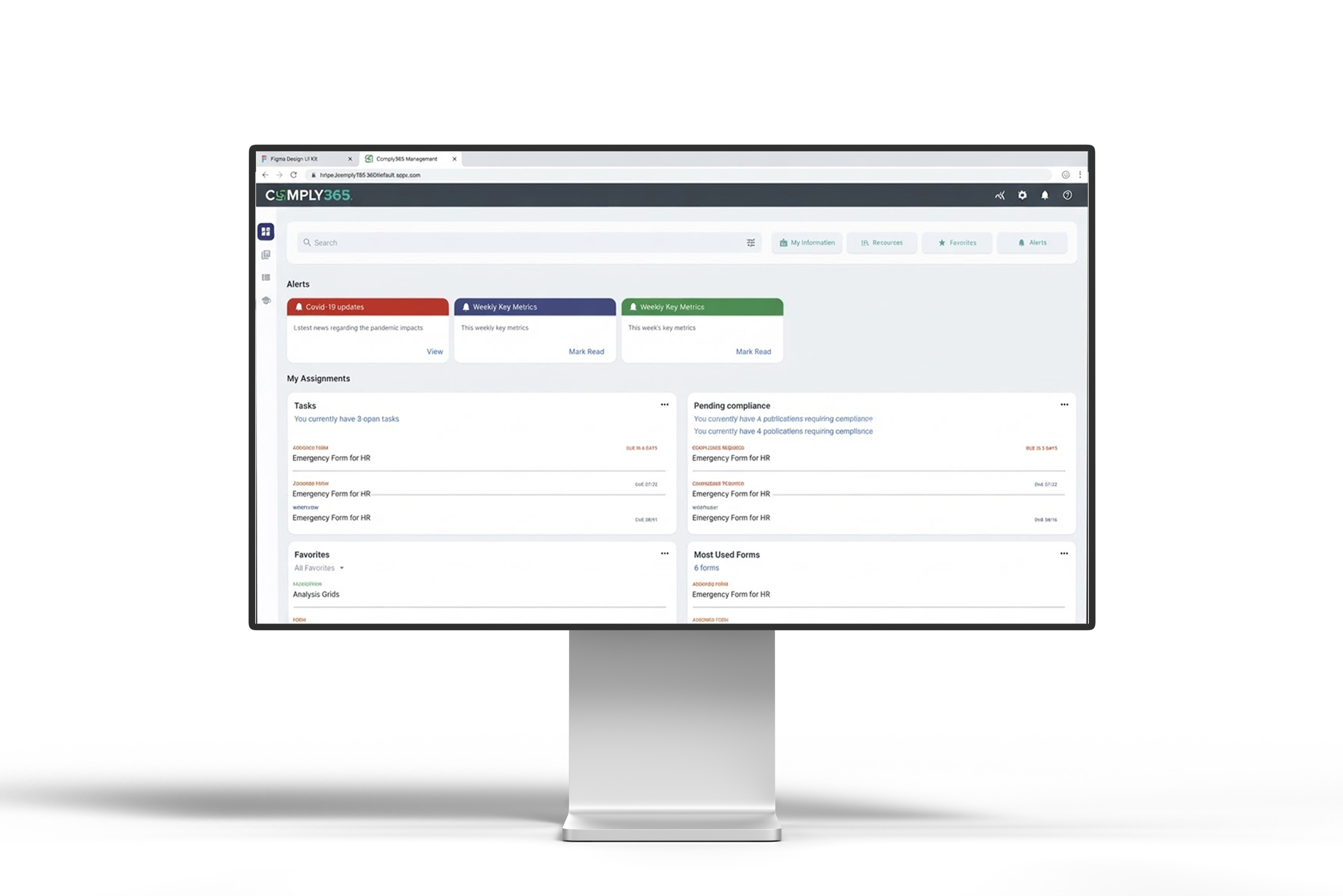
Sectioned areas with clear priority, configurable by system owner because departments across an airline have different requirements.
Key decision
Configurable by owner rather than one dashboard for everyone. Aviation departments don't share a definition of urgent.
Supporting the dashboard
Notifications and search that actually find it
Problem
Collaboration ran on email and memory, and finding a specific document meant already knowing where it lived.
What I designed
A notification system on the dashboard so people know when they are needed, plus search with advanced filters that returns the right document instead of a list to sift through.
Key decision
Both live on the dashboard. The homepage becomes where work starts, not a landing page.
05
Outcomes
What changed because of the work.
The redesign shipped alongside the legacy interface, and customers chose which one to use.
50%+
Accounts migrated voluntarily
Within the first several months
16–20
Airline executives on the advisory board
American Airlines, Southwest, NetJets
3
Panel patterns baselined platform-wide
Three-panel, two-panel, single core panel
Beyond the numbers
—
Reviewing several documents without losing your place
—
A homepage that shows what needs action, not just what exists
—
One panel structure behind every data-heavy workflow
Next case study — Chapter IV
Designing for Human Trust
Read case study
→
Open to new opportunities
Let’s build the next thing.
Start a conversation
→
joshuabalderson@gmail.com
linkedin.com/in/joshua-balderson
Based in
Columbus, Ohio
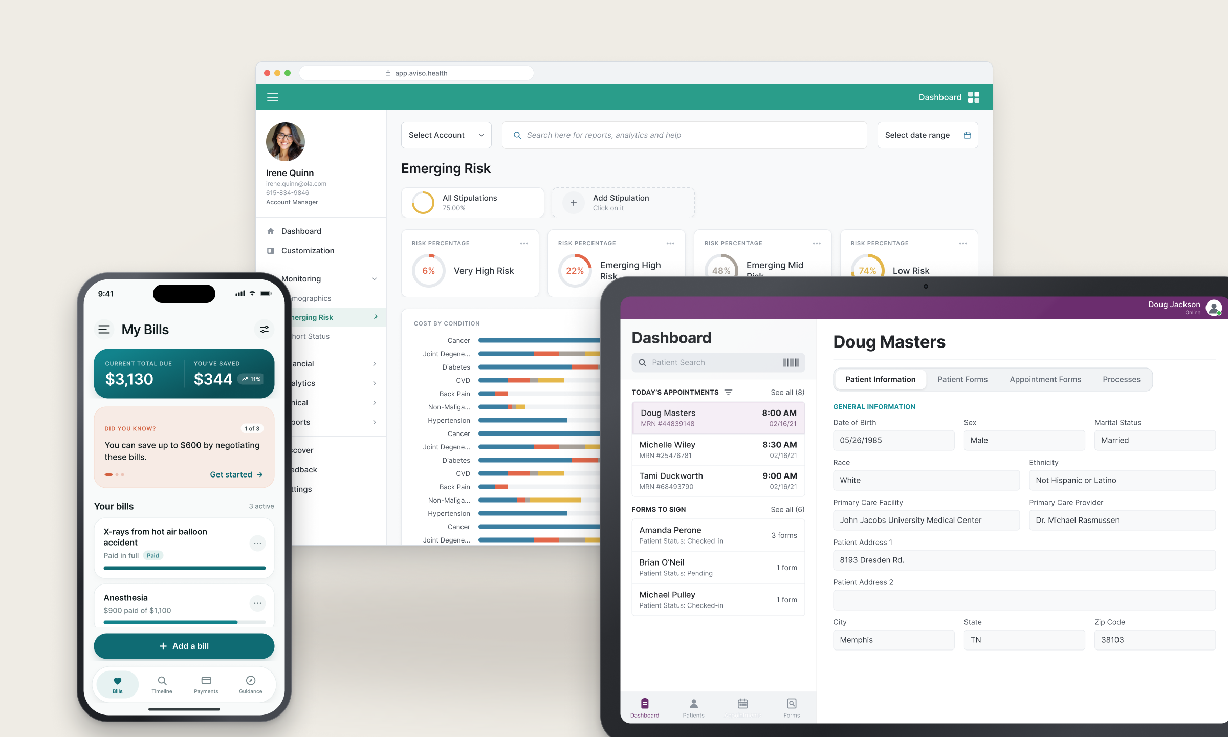
Fifteen years designing for regulated, operationally complex industries: aviation, healthcare, financial services, and employee benefits.
© 2026 Joshua Balderson
J B
Work
Approach
About
← All work
/
Chapter III — Simplifying enterprise complexity
Comply365: reorganizing airline compliance software so the right path is the obvious one.
Airline compliance software held years of operational knowledge, but the interface buried it. Rather than removing complexity, I reorganized it: predictable navigation, actionable dashboards, and repeatable patterns for data-heavy work.
Role
Lead Designer
Company
Comply365
Industry
Aviation
Timeline
2021 – 2024
Scope
Navigation · Dashboards · Workflow patterns
The challenge
Years of operational knowledge buried behind dense navigation, disconnected workflows, and information-heavy screens that slowed everyday work.
The approach
Reorganize instead of remove: predictable navigation, dashboards people act from, and data-heavy workflows redesigned into repeatable patterns.
The outcome
More than half of accounts migrated to the new experience within months, with the legacy interface still running and migration entirely optional.
01
Context
Years of operational knowledge, buried in the interface.
Enterprise software doesn't have to feel like enterprise software. The value was already in the platform. People just couldn't reach it quickly.
Background
Comply365 is airline compliance software. It had grown over years to hold the documents, tasks and operational knowledge airline teams depend on. The depth was never the problem.
Whether designing dashboards or administrative workflows, the goal was the same: reduce friction, improve clarity, and make a complex system feel intuitive without losing anything it could do.
Who it’s for
Airline operations teams
Need the right document fast, in the middle of real operational work.
Compliance managers
Track what is done, what is due, and what needs action.
Administrators
Configure and maintain a platform that has grown over years.
02
The problem
Built to show one thing at a time, for a job that needs several.
Three frictions shaped the redesign. The second one came straight out of a Customer Advisory Board session.
01
One item at a time
Opening a document from a list replaced the list. Reviewing several documents in one sitting meant clicking back and forth constantly.
Evidence — workflow mapping across document review tasks
02
Twenty browser tabs
Every document opened in a new browser tab. People kept twenty open at once and had to remember what each one held.
Evidence — Customer Advisory Board sessions with American Airlines, Southwest and NetJets
03
No sense of priority
Nothing signalled which documents needed approval, how urgent they were, or what the next action was.
Evidence — dashboard audit and advisory board feedback
Business goal
Make everyday compliance work faster and clearer, without removing the depth airlines rely on.
How the work went
01
Discover
Mapped where the platform’s operational knowledge lived, and where people lost time reaching it.
Artifacts
Workflow mapping · Heuristic audit · Interviews
02
Define
Framed the problem as organization, not volume. Keep the complexity, change its structure.
Artifacts
Problem framing · IA audit · Priorities
03
Explore
Explored navigation and layout models against real, data-heavy screens rather than ideal ones.
Artifacts
Navigation concepts · Layout explorations
04
Systematize
Turned the strongest approaches into three repeatable patterns that scaled across the platform.
Artifacts
3-tier nav · Card patterns · Three-panel layout
05
Validate
Ran the patterns past the Customer Advisory Board and iterated on what slowed people down.
Artifacts
Prototypes · Usability sessions · Iterations
06
Ship
Rolled the patterns out across the platform alongside engineering.
Artifacts
Specs · Design QA · Rollout plan
03
Research · the advisory board
The workarounds became the requirements.
I ran a Customer Advisory Board of 16–20 executives and operators from American Airlines, Southwest and NetJets, and many more; meeting every two weeks.
How the sessions ran
Each session opened with design updates for feedback and closed with a knowledge share, where customers walked through how they actually used the legacy system day to day.
The second half mattered more. Every company had invented its own workflows to make the old system bearable, and no two did it the same way. Those workarounds were the clearest statement of what the platform should have been doing.
What I did with it
Watch the workaround
Customers walked through the sequences they had invented to get through the legacy system.
Find the need underneath
A workaround is a symptom. The question was what job it was doing, and why the platform forced them into it.
Architect it in
The need became a designed construct in the new system, so the workaround stopped being necessary. The three-panel model came out of exactly this.
04
Solutions
Two overhauls: how documents are read, and where work begins.
The panel changed document review. The dashboard changed what people see first. Everything else followed from those two.
Overhaul 01
The three-panel reading model
Problem
Opening a document replaced the list, and each one spawned a browser tab. Reviewing several documents meant constant back-and-forth and twenty tabs nobody could tell apart.
What I designed
A left panel holding the document list, a centre panel that displays the selected document instantly, and a third panel that opens on demand for metadata. Structured left to right, with one click to close everything and move to the next document.
Key decision
No new tabs, ever. The panel replaced the browser as the place people keep their context.
Overhaul 02
A dashboard that ranks the work
Problem
The legacy homepage treated every document the same. Nothing showed what needed approval, how urgent it was, or what to do with it.
What I designed
Sectioned areas with clear priority, configurable by system owner because departments across an airline have different requirements.
Key decision
Configurable by owner rather than one dashboard for everyone. Aviation departments don't share a definition of urgent.
Supporting the dashboard
Notifications and search that actually find it
Problem
Collaboration ran on email and memory, and finding a specific document meant already knowing where it lived.
What I designed
A notification system on the dashboard so people know when they are needed, plus search with advanced filters that returns the right document instead of a list to sift through.
Key decision
Both live on the dashboard. The homepage becomes where work starts, not a landing page.
05
Outcomes
What changed because of the work.
The redesign shipped alongside the legacy interface, and customers chose which one to use.
50%+
Accounts migrated voluntarily
Within the first several months
16–20
Airline executives on the advisory board
American Airlines, Southwest, NetJets
3
Panel patterns baselined platform-wide
Three-panel, two-panel, single core panel
Beyond the numbers
—
Reviewing several documents without losing your place
—
A homepage that shows what needs action, not just what exists
—
One panel structure behind every data-heavy workflow
Next case study — Chapter IV
Designing for Human Trust
Read case study
→
Open to new opportunities
Let’s build the next thing.
Start a conversation
→
joshuabalderson@gmail.com
linkedin.com/in/joshua-balderson
Based in
Columbus, Ohio
Fifteen years designing for regulated, operationally complex industries: aviation, healthcare, financial services, and employee benefits.
© 2026 Joshua Balderson
J B
Work
Approach
About
← All work
/
Chapter III — Simplifying enterprise complexity
Comply365: reorganizing airline compliance software so the right path is the obvious one.
Airline compliance software held years of operational knowledge, but the interface buried it. Rather than removing complexity, I reorganized it: predictable navigation, actionable dashboards, and repeatable patterns for data-heavy work.
Role
Lead Designer
Company
Comply365
Industry
Aviation
Scope
Navigation · Dashboards · Workflow patterns
The challenge
Years of operational knowledge buried behind dense navigation, disconnected workflows, and information-heavy screens that slowed everyday work.
The approach
Reorganize instead of remove: predictable navigation, dashboards people act from, and data-heavy workflows redesigned into repeatable patterns.
The outcome
More than half of accounts migrated to the new experience within months, with the legacy interface still running and migration entirely optional.
01
Context
Years of operational knowledge, buried in the interface.
Enterprise software doesn't have to feel like enterprise software. The value was already in the platform. People just couldn't reach it quickly.
Background
Comply365 is airline compliance software. It had grown over years to hold the documents, tasks and operational knowledge airline teams depend on. The depth was never the problem.
Whether designing dashboards or administrative workflows, the goal was the same: reduce friction, improve clarity, and make a complex system feel intuitive without losing anything it could do.
Who it’s for
Airline operations teams
Need the right document fast, in the middle of real operational work.
Compliance managers
Track what is done, what is due, and what needs action.
Administrators
Configure and maintain a platform that has grown over years.
02
The problem
Built to show one thing at a time, for a job that needs several.
Three frictions shaped the redesign. The second one came straight out of a Customer Advisory Board session.
01
One item at a time
Opening a document from a list replaced the list. Reviewing several documents in one sitting meant clicking back and forth constantly.
Evidence — workflow mapping across document review tasks
02
Twenty browser tabs
Every document opened in a new browser tab. People kept twenty open at once and had to remember what each one held.
Evidence — Customer Advisory Board sessions with American Airlines, Southwest and NetJets
03
No sense of priority
Nothing signalled which documents needed approval, how urgent they were, or what the next action was.
Evidence — dashboard audit and advisory board feedback
Business goal
Make everyday compliance work faster and clearer, without removing the depth airlines rely on.
How the work went
01
Discover
Mapped where the platform’s operational knowledge lived, and where people lost time reaching it.
Artifacts
Workflow mapping · Heuristic audit · Interviews
02
Define
Framed the problem as organization, not volume. Keep the complexity, change its structure.
Artifacts
Problem framing · IA audit · Priorities
03
Explore
Explored navigation and layout models against real, data-heavy screens rather than ideal ones.
Artifacts
Navigation concepts · Layout explorations
04
Systematize
Turned the strongest approaches into three repeatable patterns that scaled across the platform.
Artifacts
3-tier nav · Card patterns · Three-panel layout
05
Validate
Ran the patterns past the Customer Advisory Board and iterated on what slowed people down.
Artifacts
Prototypes · Usability sessions · Iterations
06
Ship
Rolled the patterns out across the platform alongside engineering.
Artifacts
Specs · Design QA · Rollout plan
03
Research · the advisory board
The workarounds became the requirements.
I ran a Customer Advisory Board of 16–20 executives and operators from American Airlines, Southwest and NetJets, and many more; meeting every two weeks.
How the sessions ran
Each session opened with design updates for feedback and closed with a knowledge share, where customers walked through how they actually used the legacy system day to day.
The second half mattered more. Every company had invented its own workflows to make the old system bearable, and no two did it the same way. Those workarounds were the clearest statement of what the platform should have been doing.
What I did with it
Watch the workaround
Customers walked through the sequences they had invented to get through the legacy system.
Find the need underneath
A workaround is a symptom. The question was what job it was doing, and why the platform forced them into it.
Architect it in
The need became a designed construct in the new system, so the workaround stopped being necessary. The three-panel model came out of exactly this.
04
Solutions
Two overhauls: how documents are read, and where work begins.
The panel changed document review. The dashboard changed what people see first. Everything else followed from those two.
Overhaul 01
The three-panel reading model
Problem
Opening a document replaced the list, and each one spawned a browser tab. Reviewing several documents meant constant back-and-forth and twenty tabs nobody could tell apart.
What I designed
A left panel holding the document list, a centre panel that displays the selected document instantly, and a third panel that opens on demand for metadata. Structured left to right, with one click to close everything and move to the next document.
Key decision
No new tabs, ever. The panel replaced the browser as the place people keep their context.
Overhaul 02
A dashboard that ranks the work
Problem
The legacy homepage treated every document the same. Nothing showed what needed approval, how urgent it was, or what to do with it.
What I designed
Sectioned areas with clear priority, configurable by system owner because departments across an airline have different requirements.
Key decision
Configurable by owner rather than one dashboard for everyone. Aviation departments don't share a definition of urgent.
Supporting the dashboard
Notifications and search that actually find it
Problem
Collaboration ran on email and memory, and finding a specific document meant already knowing where it lived.
What I designed
A notification system on the dashboard so people know when they are needed, plus search with advanced filters that returns the right document instead of a list to sift through.
Key decision
Both live on the dashboard. The homepage becomes where work starts, not a landing page.
05
Outcomes
What changed because of the work.
The redesign shipped alongside the legacy interface, and customers chose which one to use.
50%+
Accounts migrated voluntarily
Within the first several months
16–20
Airline executives on the advisory board
American Airlines, Southwest, NetJets
3
Panel patterns baselined platform-wide
Three-panel, two-panel, single core panel
Beyond the numbers
—
Reviewing several documents without losing your place
—
A homepage that shows what needs action, not just what exists
—
One panel structure behind every data-heavy workflow
Next case study — Chapter IV
Designing for Human Trust
Read case study
→
Open to new opportunities
Let’s build the next thing.
Start a conversation
→
joshuabalderson@gmail.com
linkedin.com/in/joshua-balderson
Based in
Columbus, Ohio
Fifteen years designing for regulated, operationally complex industries: aviation, healthcare, financial services, and employee benefits.
© 2026 Joshua Balderson