J B
Menu
Three healthcare products, three different problems.
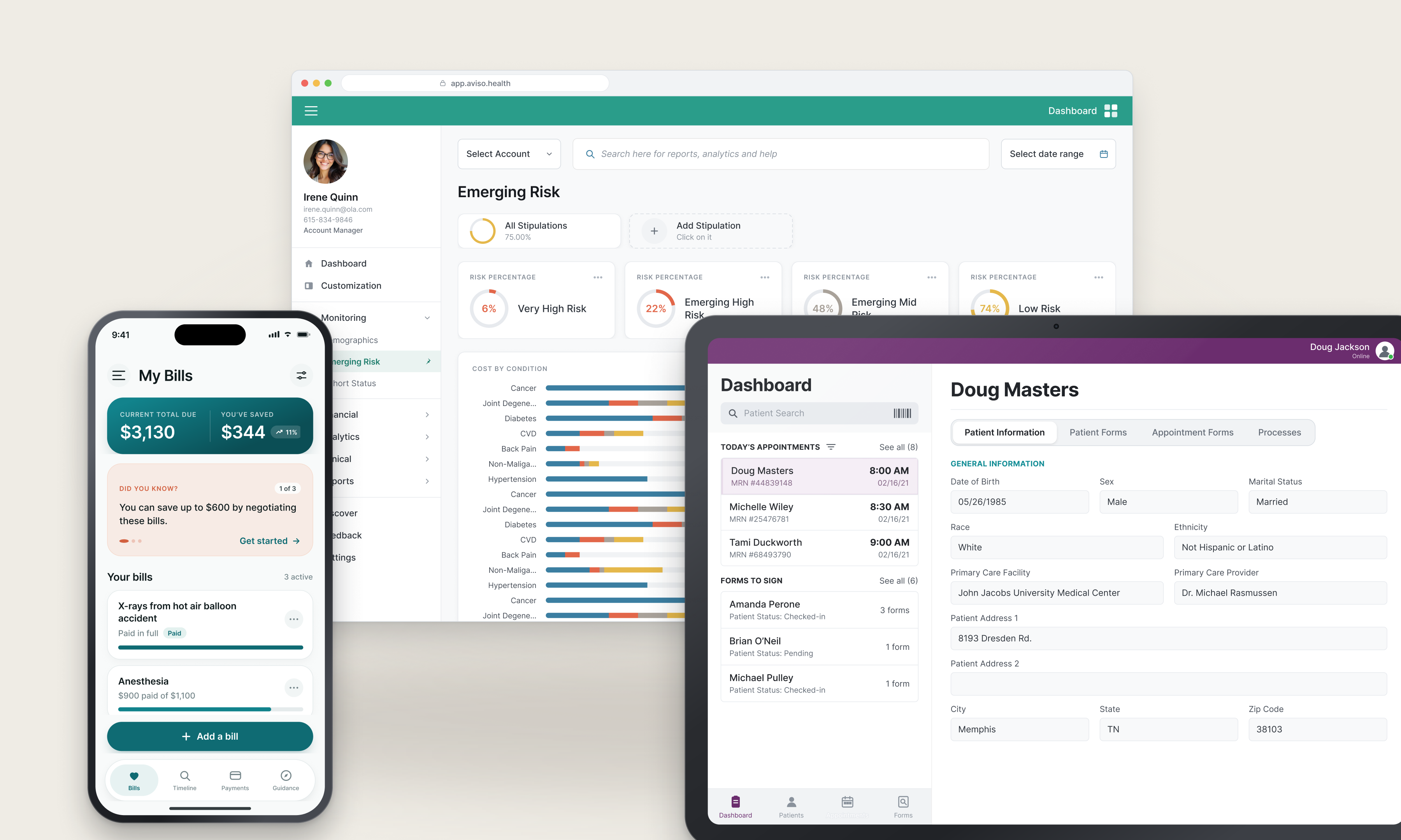
Consulting at Core10, I designed for three healthcare companies in under two years. A patient cost-transparency app, a population risk analytics platform, and a tablet check-in system for surgical intake. Different users, different constraints, one recurring demand: get people the information that matters right now, and nothing else.
Role
Senior UI/UX Designer
Company
Core10 (client work)
Platform
iOS · Android · Web · Tablet
Timeline
2019 – 2021
Scope
Research · UX · UI · Prototyping
The challenge
Healthcare products carry more data than any screen can show, under rules about what must be visible and what must be consented to. Each of these three had that problem in a different shape.
The approach
Decide what matters in the moment the product is used, put that at the front, and make everything else reachable rather than present.
The outcome
Three products shipped for three clients, including a plugin marketplace that let customers build their own dashboards instead of waiting on us.
01
Context
Three clients, three problems, one industry.
Consulting means you are not the domain expert. You have to become useful in someone else's field quickly, and be wrong about it out loud early enough to matter.
Background
At Core10 I worked as an embedded designer on client products. In healthcare that meant three companies inside two years, each with its own users, regulatory surface, and definition of urgent.
None of them could be solved by simplifying. The data was the product. The work was deciding what surfaces first, what waits, and who gets to decide that.
Who used them
Patients
Trying to understand what a procedure costs, and whether that number is negotiable.
Analysts and administrators
Measuring population health risk across regions, with a different question every time.
Clinical intake staff
Checking patients in and capturing signatures for surgery, on a tablet, while the schedule moves.
What stayed constant
Strict industry, heavy data, fast-moving users. The pertinent information had to be at the front every time.
02
The three products
Three clients, three answers.
Each had a different user and a different constraint. I was the sole designer on two of them, running the research and setting requirements directly with the client's product owner. On the third I worked inside a small design team. Described by category rather than by name, since the client work was done under agreement.
Product 01
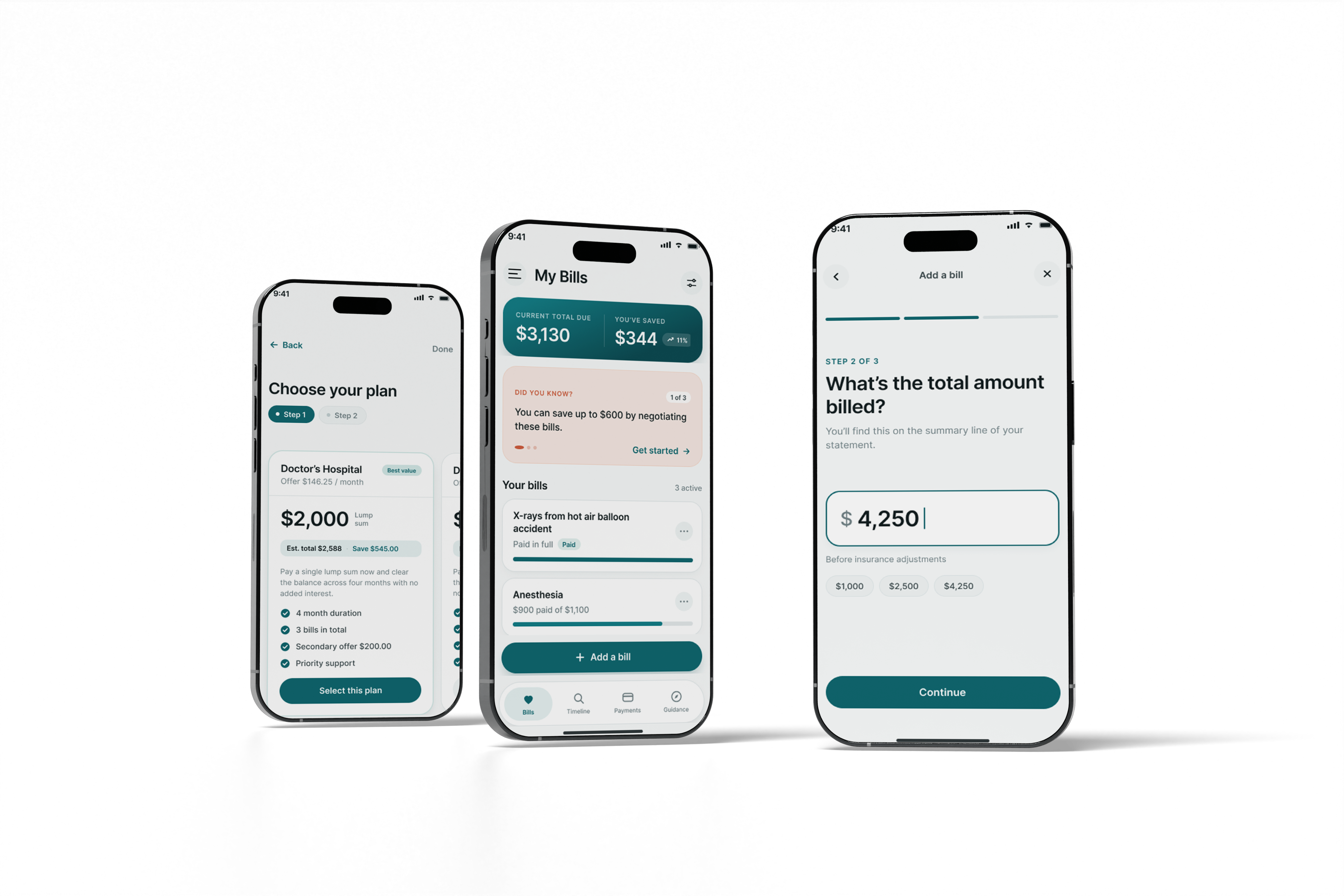
Cost transparency for patients
Problem
Patients had no way to know what a procedure would cost, and most did not know that the price was something they could argue with at all.
What I designed
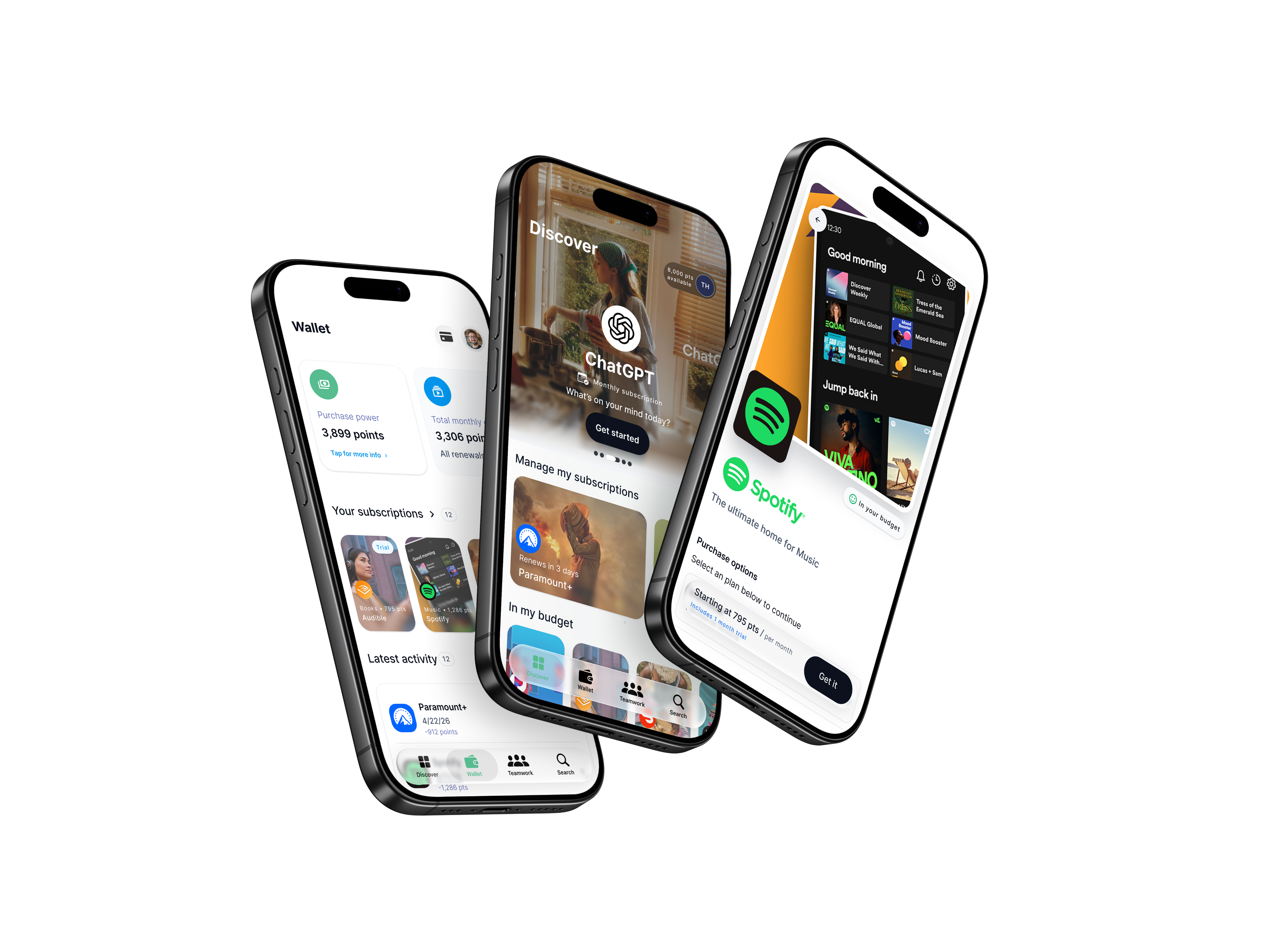
A mobile app showing the actual quoted price alongside what a negotiated price could realistically look like, with the case a patient could make to get there.
Key decision
Show both numbers together. A single price is a fact you accept; two prices side by side is a decision you can act on.
Product 02
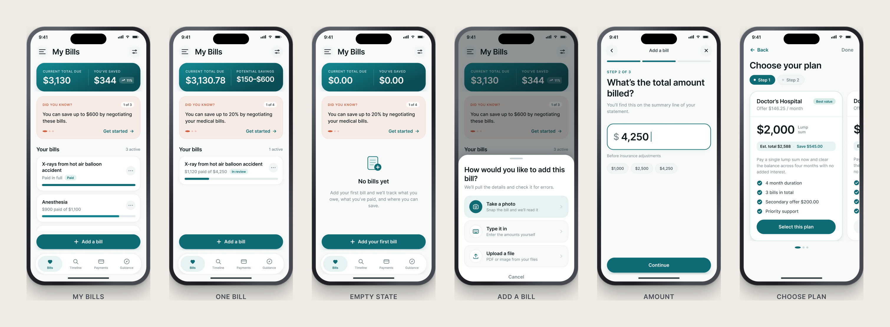
Risk analytics, and a plugin store
Problem
A population health platform measuring risk by region, from diabetes rates to cardiac indicators. The data was vast and every customer needed a different view of it.
What I designed
Rather than designing dashboards for each customer, I designed a store inside the product. Users add the graph plugins they need to build their own dashboard, and customer companies can build plugins and publish them back to the store.
Key decision
Stop designing dashboards and design the thing that makes them. I was brought in to modernize a single page. I redesigned the app around this idea instead, presented it unasked, and the engagement changed to match.
Product 03
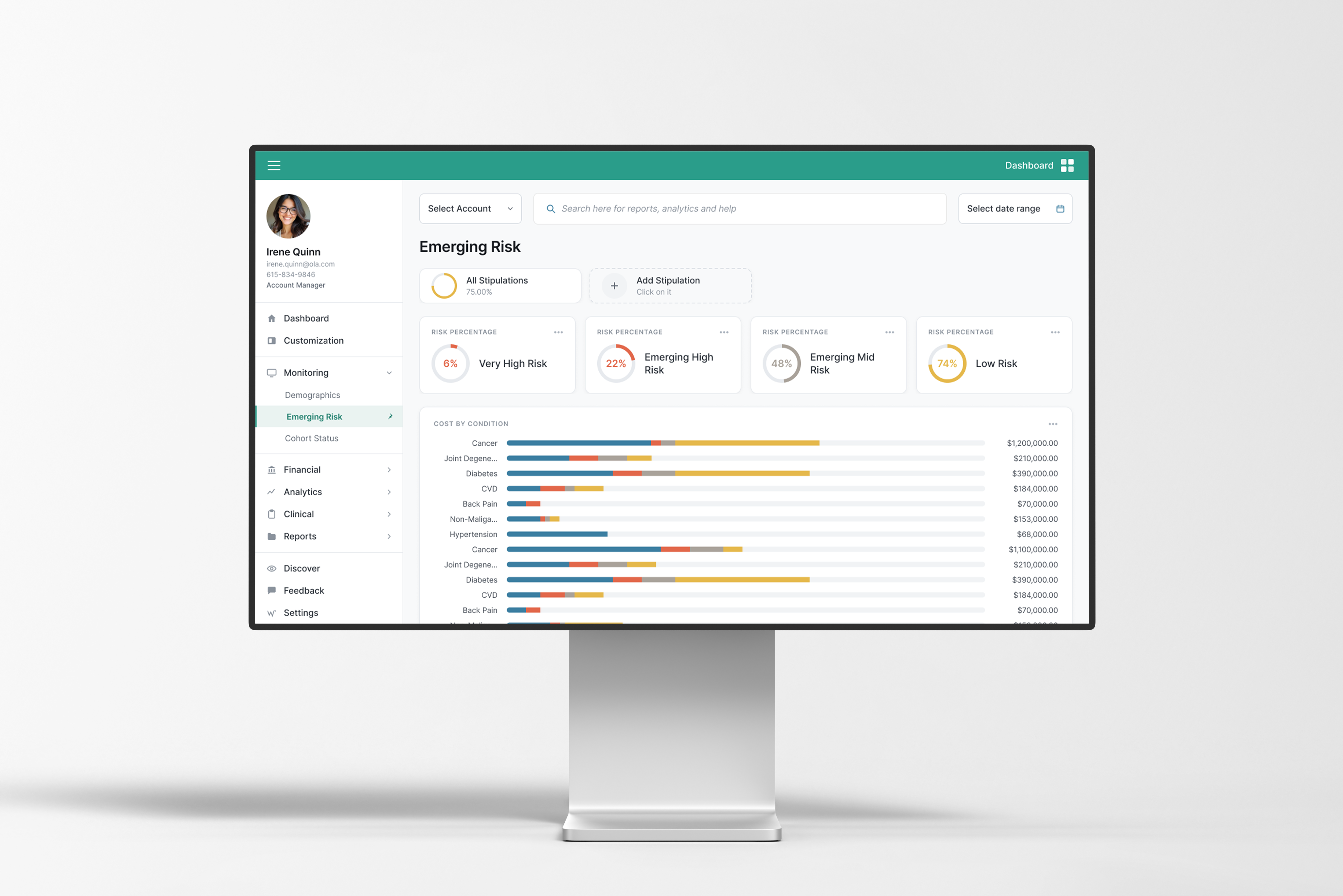
Tablet check-in and real-time signature
Problem
Intake staff needed to see who was arriving, find a specific patient fast, and capture signatures for surgical consent in real time, all while the schedule kept moving.
What I designed
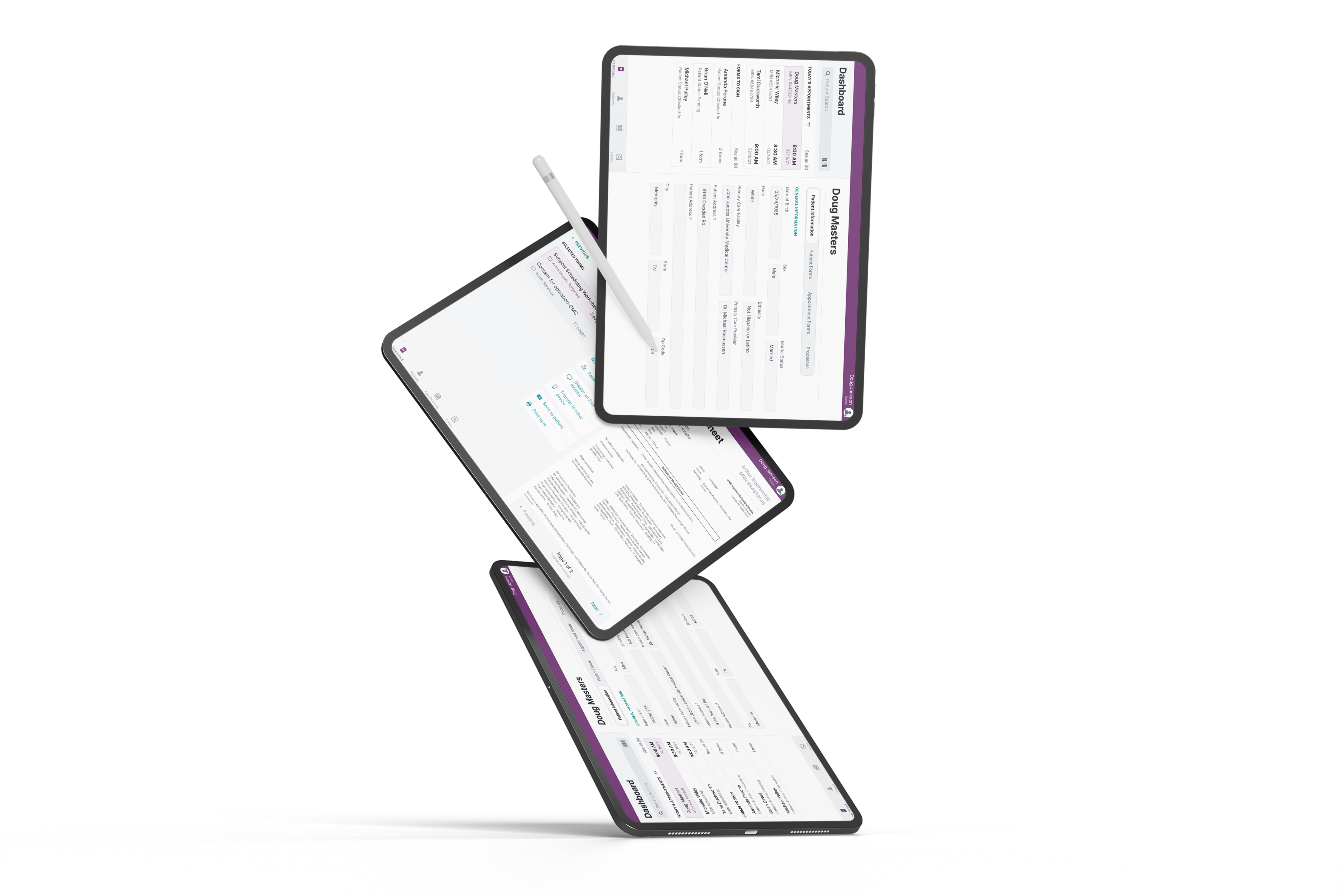
A left navigation panel that behaved like a phone app, driving movement through patient and appointment information. Selecting a patient opened a right panel with its own segmented control for the record and the documents needing signature.
Key decision
A panel instead of a page change. Nothing the staff member had found was lost when they went deeper, which mattered more than any visual decision on the screen.
03
What carried forward
Same industry, same instinct.
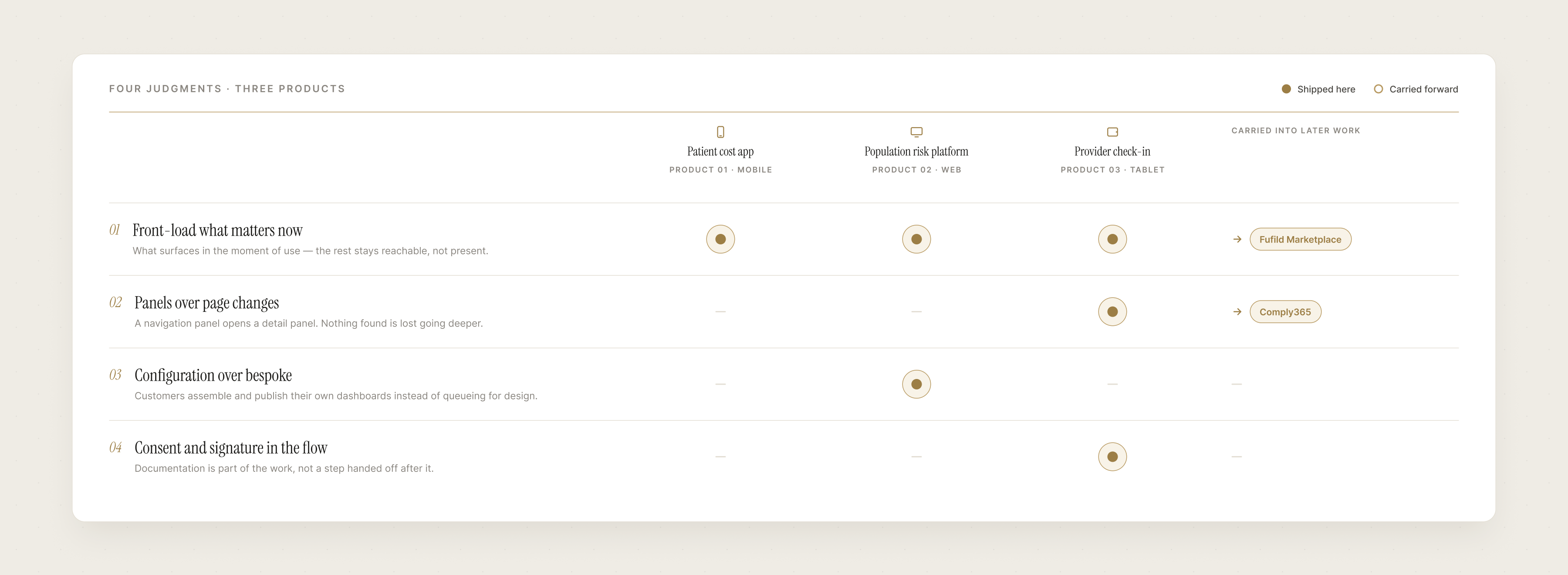
Three products with almost nothing in common on the surface, built on the same four judgments.
01
Front-load what matters now
Healthcare products hold more data than a screen can hold. The work was deciding what surfaces in the moment the product is used, and making the rest reachable instead of present.
All three products
02
Panels over page changes
The tablet check-in used a left navigation panel opening a right detail panel with its own segmented control. Nothing found was lost when someone went deeper. Two years later I rebuilt the same model at scale for Comply365.
Product 03, and later Comply365
03
Configuration over bespoke
When every customer needs a different view, the answer is not more views. The plugin store let customers assemble and publish their own dashboards instead of queueing behind a design team.
Product 02
04
Consent and signature in the flow
Documentation is not a step after the work in healthcare, it is part of it. Signature capture lived inside the check-in flow rather than being handed off to a separate process.
Product 03
What shipped
Two of the three went into production. The tablet intake system shipped and the client still features the work publicly. The risk analytics platform implemented the redesign, including the plugin store that was never part of the original scope. Consulting means you rarely see the long tail: engagements end, logins expire, and what happens after is often out of view.
Next case study — Chapter I
Building Products from Ambiguity
Read case study
→
Open to new opportunities
Let’s build the next thing.
Let’s connect
→
joshuabalderson@gmail.com
linkedin.com/in/joshua-balderson
Based in
Columbus, Ohio
Ten years designing for regulated, operationally complex industries: aviation, healthcare, financial services, and employee benefits.
© 2026 Joshua Balderson
J B
Work
Approach
About
Three healthcare products, three different problems.
Consulting at Core10, I designed for three healthcare companies in under two years. A patient cost-transparency app, a population risk analysis platform, and a tablet check-in system for surgical intake. Different users, different constraints, one recurring demand: get people the information that matters right now, and nothing else.
Role
Senior UI/UX Designer
Company
Core10 (client work)
Platform
iOS · Android · Web · Tablet
Timeline
2019 – 2021
Scope
Research · UX · UI · Prototyping
The challenge
Healthcare products carry more data than any screen can show, under rules about what must be visible and what must be consented to. Each of these three had that problem in a different shape.
The approach
Decide what matters in the moment the product is used, put that at the front, and make everything else reachable rather than present.
The outcome
Three products shipped for three clients, including a plugin marketplace that let customers build their own dashboards instead of waiting on us.
01
Context
Three clients, three problems, one industry.
Consulting means you are not the domain expert. You have to become useful in someone else's field quickly, and be wrong about it out loud early enough to matter.
Background
At Core10 I worked as an embedded designer on client products. In healthcare that meant three companies inside two years, each with its own users, regulatory surface, and definition of urgent.
None of them could be solved by simplifying. The data was the product. The work was deciding what surfaces first, what waits, and who gets to decide that.
Who used them
Patients
Trying to understand what a procedure costs, and whether that number is negotiable.
Analysts and administrators
Measuring population health risk across regions, with a different question every time.
Clinical intake staff
Checking patients in and capturing signatures for surgery, on a tablet, while the schedule moves.
What stayed constant
Strict industry, heavy data, fast-moving users. The pertinent information had to be at the front every time.
02
The three products
Three clients, three answers.
Each had a different user and a different constraint. I was the sole designer on two of them, running the research and setting requirements directly with the client's product owner. On the third I worked inside a small design team. Described by category rather than by name, since the client work was done under agreement.
Product 01
Cost transparency for patients
Problem
Patients had no way to know what a procedure would cost, and most did not know that the price was something they could negotiate.
What I designed
A mobile app showing the actual quoted price alongside what a negotiated price could realistically look like, with the case a patient could make to get there.
Key decision
Show both numbers together. A single price is a fact you accept; two prices side by side is a decision you can act on.
Product 02
Risk analytics, and a plugin store
Problem
A population health platform measuring risk by region, from diabetes rates to cardiac indicators. The data was vast and every customer needed a different view of it.
What I designed
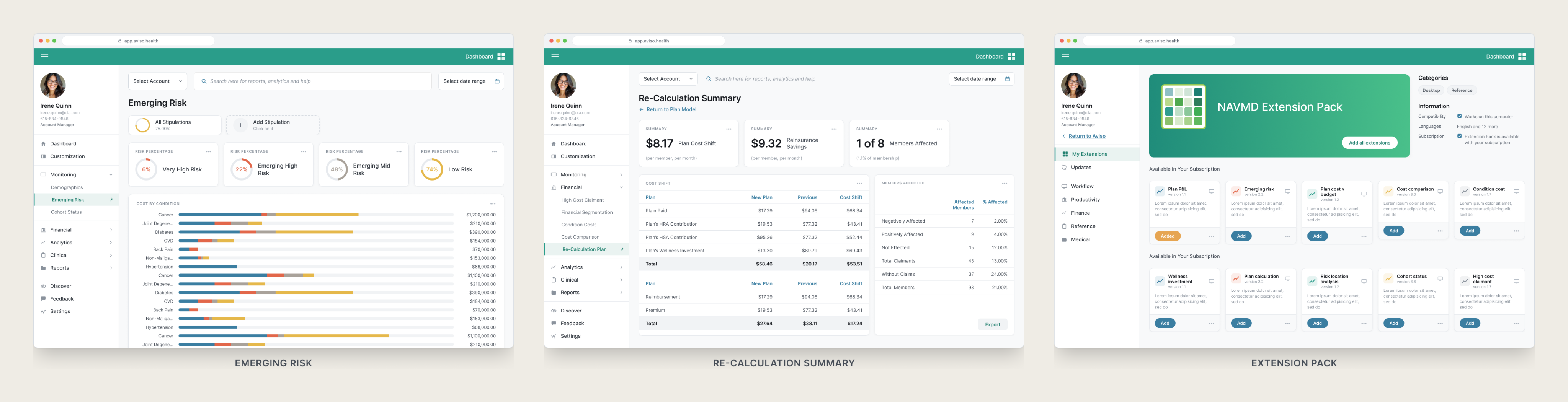
Rather than designing dashboards for each customer, I designed a store inside the product. Users add the graph plugins they need to build their own dashboard, and customer companies can build plugins and publish them back to the store.
Key decision
Stop designing dashboards and design the thing that makes them. I was brought in to modernize a single page. I redesigned the app around this idea instead, presented it unasked, and the engagement changed to match.
Product 03
Tablet check-in and real-time signature
Problem
Intake staff needed to see who was arriving, find a specific patient fast, and capture signatures for surgical consent in real time, all while the schedule kept moving.
What I designed
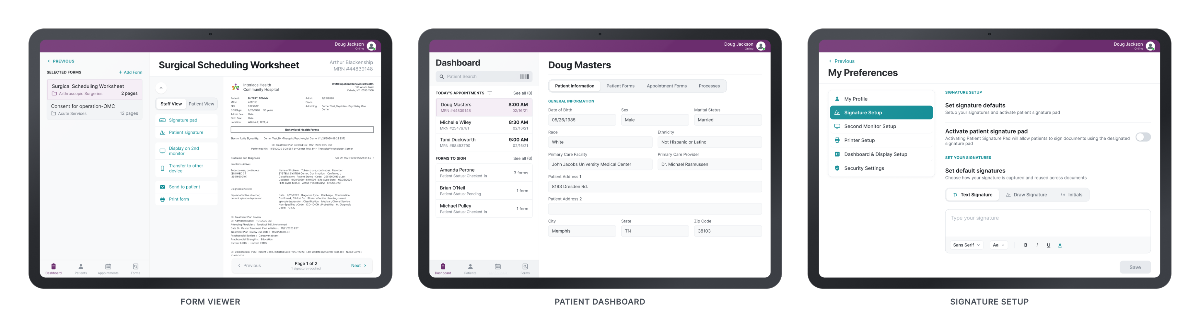
A left navigation panel that behaved like a phone app, driving movement through patient and appointment information. Selecting a patient opened a right panel with its own segmented control for the record and the documents needing signature.
Key decision
A panel instead of a page change. Nothing the staff member had found was lost when they went deeper, which mattered more than any visual decision on the screen.
03
What carried forward
Same industry, same instinct.
Three products with almost nothing in common on the surface, built on the same four judgments.
01
Front-load what matters now
Healthcare products hold more data than a screen can hold. The work was deciding what surfaces in the moment the product is used, and making the rest reachable instead of present.
All three products and later Fufild
02
Panels over page changes
The tablet check-in used a left navigation panel opening a right detail panel with its own segmented control. Nothing found was lost when someone went deeper. Two years later I rebuilt the same model at scale for Comply365.
Product 03, and later Comply365
03
Configuration over bespoke
When every customer needs a different view, the answer is not more views. The plugin store let customers assemble and publish their own dashboards instead of queueing behind a design team.
Product 02
04
Consent and signature in the flow
Documentation is not a step after the work in healthcare, it is part of it. Signature capture lived inside the check-in flow rather than being handed off to a separate process.
Product 03
What shipped
Two of the three went into production. The tablet intake system shipped and the client still features the work publicly. The risk analytics platform implemented the redesign, including the plugin store that was never part of the original scope. Consulting means you rarely see the long tail: engagements end, logins expire, and what happens after is often out of view.
Next case study — Chapter I
Building Products from Ambiguity
Read case study
→
Open to new opportunities
Let’s build the next thing.
Let’s connect
→
joshuabalderson@gmail.com
linkedin.com/in/joshua-balderson
Based in
Columbus, Ohio
Ten years designing for regulated, operationally complex industries: aviation, healthcare, financial services, and employee benefits.
© 2026 Joshua Balderson
J B
Work
Approach
About
Three healthcare products, three different problems.
Consulting at Core10, I designed for three healthcare companies in under two years. A patient cost-transparency app, a population risk analysis platform, and a tablet check-in system for surgical intake. Different users, different constraints, one recurring demand: get people the information that matters right now, and nothing else.
Role
Senior UI/UX Designer
Company
Core10 (client work)
Platform
iOS · Android · Web · Tablet
Timeline
2019 – 2021
Scope
Research · UX · UI · Prototyping
The challenge
Healthcare products carry more data than any screen can show, under rules about what must be visible and what must be consented to. Each of these three had that problem in a different shape.
The approach
Decide what matters in the moment the product is used, put that at the front, and make everything else reachable rather than present.
The outcome
Three products shipped for three clients, including a plugin marketplace that let customers build their own dashboards instead of waiting on us.
01
Context
Three clients, three problems, one industry.
Consulting means you are not the domain expert. You have to become useful in someone else's field quickly, and be wrong about it out loud early enough to matter.
Background
At Core10 I worked as an embedded designer on client products. In healthcare that meant three companies inside two years, each with its own users, regulatory surface, and definition of urgent.
None of them could be solved by simplifying. The data was the product. The work was deciding what surfaces first, what waits, and who gets to decide that.
Who used them
Patients
Trying to understand what a procedure costs, and whether that number is negotiable.
Analysts and administrators
Measuring population health risk across regions, with a different question every time.
Clinical intake staff
Checking patients in and capturing signatures for surgery, on a tablet, while the schedule moves.
What stayed constant
Strict industry, heavy data, fast-moving users. The pertinent information had to be at the front every time.
02
The three products
Three clients, three answers.
Each had a different user and a different constraint. I was the sole designer on two of them, running the research and setting requirements directly with the client's product owner. On the third I worked inside a small design team. Described by category rather than by name, since the client work was done under agreement.
Product 01
Cost transparency for patients
Problem
Patients had no way to know what a procedure would cost, and most did not know that the price was something they could negotiate.
What I designed
A mobile app showing the actual quoted price alongside what a negotiated price could realistically look like, with the case a patient could make to get there.
Key decision
Show both numbers together. A single price is a fact you accept; two prices side by side is a decision you can act on.
Product 02
Risk analytics, and a plugin store
Problem
A population health platform measuring risk by region, from diabetes rates to cardiac indicators. The data was vast and every customer needed a different view of it.
What I designed
Rather than designing dashboards for each customer, I designed a store inside the product. Users add the graph plugins they need to build their own dashboard, and customer companies can build plugins and publish them back to the store.
Key decision
Stop designing dashboards and design the thing that makes them. I was brought in to modernize a single page. I redesigned the app around this idea instead, presented it unasked, and the engagement changed to match.
Product 03
Tablet check-in and real-time signature
Problem
Intake staff needed to see who was arriving, find a specific patient fast, and capture signatures for surgical consent in real time, all while the schedule kept moving.
What I designed
A left navigation panel that behaved like a phone app, driving movement through patient and appointment information. Selecting a patient opened a right panel with its own segmented control for the record and the documents needing signature.
Key decision
A panel instead of a page change. Nothing the staff member had found was lost when they went deeper, which mattered more than any visual decision on the screen.
03
What carried forward
Same industry, same instinct.
Three products with almost nothing in common on the surface, built on the same four judgments.
01
Front-load what matters now
Healthcare products hold more data than a screen can hold. The work was deciding what surfaces in the moment the product is used, and making the rest reachable instead of present.
All three products and later Fufild
02
Panels over page changes
The tablet check-in used a left navigation panel opening a right detail panel with its own segmented control. Nothing found was lost when someone went deeper. Two years later I rebuilt the same model at scale for Comply365.
Product 03, and later Comply365
03
Configuration over bespoke
When every customer needs a different view, the answer is not more views. The plugin store let customers assemble and publish their own dashboards instead of queueing behind a design team.
Product 02
04
Consent and signature in the flow
Documentation is not a step after the work in healthcare, it is part of it. Signature capture lived inside the check-in flow rather than being handed off to a separate process.
Product 03
What shipped
Two of the three went into production. The tablet intake system shipped and the client still features the work publicly. The risk analytics platform implemented the redesign, including the plugin store that was never part of the original scope. Consulting means you rarely see the long tail: engagements end, logins expire, and what happens after is often out of view.
Next case study — Chapter I
Building Products from Ambiguity
Read case study
→
Open to new opportunities
Let’s build the next thing.
Let’s connect
→
joshuabalderson@gmail.com
linkedin.com/in/joshua-balderson
Based in
Columbus, Ohio
Ten years designing for regulated, operationally complex industries: aviation, healthcare, financial services, and employee benefits.
© 2026 Joshua Balderson